22 Graphic Living Room Wall Colors for a Bold and Modern Look
Introduction
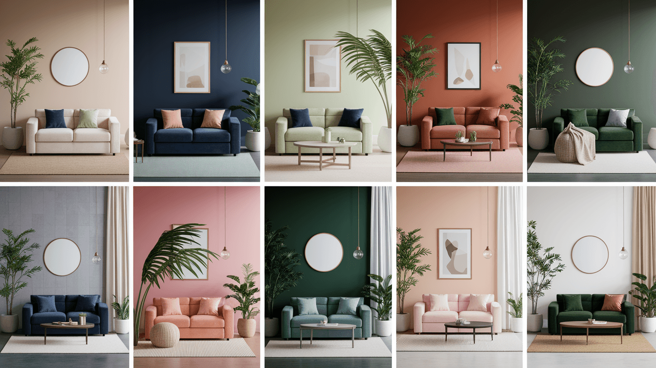
Are you ready to make a statement with your living room walls? Graphic living room wall colors bring bold contrast, sharp lines, and striking combinations that turn an ordinary room into something unforgettable. From color blocking to two-tone walls, these ideas move beyond a single flat color and create real visual impact.
These twenty-two ideas explore bold pairings, unexpected contrasts, and modern color techniques that work in living rooms of any size. Whether you want a dramatic accent wall or a full-room transformation, there is an option here that fits your style. Let us explore these graphic wall color ideas together.
1. Black and White Color Block Wall
A black and white color block wall creates an instant graphic statement in any living room. Dividing the wall into bold geometric sections, like large rectangles or triangles, adds modern energy without needing artwork. This high-contrast combination works especially well in rooms with minimalist furniture.
Keeping the rest of the room simple allows the wall to remain the focal point. Pairing this wall with metal or wood accents adds warmth to balance the contrast. This style suits contemporary and industrial living rooms particularly well.
Best For: Accent walls, modern rooms, and minimalist spaces.
Pro Tip: Keep furniture simple to highlight the wall.
2. Bold Navy and White Stripes
Wide horizontal or vertical stripes in navy and white create a striking, graphic look on a living room wall. This combination feels crisp and modern, working well in both small and large spaces. Vertical stripes can make a room feel taller, while horizontal stripes add width.
Choosing one wall for this treatment keeps the look bold without overwhelming the room. Pairing navy stripes with brass accents adds a touch of warmth. This style suits coastal, modern, and classic living rooms alike.
Best For: Accent walls, hallways, and coastal interiors.
Pro Tip: Use vertical stripes to add height to a room.
3. Color Drenched Walls in Deep Green
Color drenching, where walls, trim, and even the ceiling are painted the same bold shade, creates a dramatic, immersive look. Deep green works particularly well for this technique, adding richness and depth to a living room. This approach removes harsh contrast between surfaces.
This style works best in rooms with good natural light, where the color can feel rich rather than heavy. Pairing color-drenched walls with light furniture creates balance. This technique suits living rooms that want a bold, cocooning feel.
Best For: Full rooms, dens, and reading spaces.
Pro Tip: Use color drenching in rooms with good light.
4. Two-Tone Wall in Terracotta and Cream
Splitting a wall horizontally into two colors, like terracotta on the bottom and cream on top, creates a graphic, layered look. This technique adds visual interest without requiring patterns or artwork. The line between colors can be straight or slightly curved for a softer effect.
This style works well behind a sofa or as a feature wall in the living room. Pairing terracotta and cream with wood furniture enhances the warm, earthy feel. This combination suits both modern and traditional spaces.
Best For: Feature walls, behind sofas, and modern rooms.
Pro Tip: Use a straight line for a clean, modern look.
5. Bold Yellow Accent Wall
A bold yellow accent wall instantly energizes a living room with graphic punch. This color works especially well in rooms with neutral furniture, where it can stand out without competing for attention. Yellow pairs beautifully with charcoal, navy, and warm wood tones.
Choosing a single wall for this color keeps the look bold without overwhelming the space. Pairing yellow with black or charcoal accents adds graphic contrast. This style suits modern, eclectic, and Scandinavian living rooms.
Best For: Accent walls, modern rooms, and eclectic spaces.
Pro Tip: Pair bold yellow with charcoal accents.
6. Geometric Triangle Wall Mural
A geometric triangle mural, painted directly on the wall, creates a striking graphic feature in a living room. Choosing two or three colors, like terracotta, sage, and cream, keeps the design cohesive while still feeling bold. This style works especially well behind a sofa or media unit.
This mural can be painted with painter’s tape for clean, sharp lines. Pairing this wall with simple furniture allows the design to stand out. This style suits modern and contemporary living rooms particularly well.
Best For: Feature walls, behind sofas, and modern interiors.
Pro Tip: Use painter’s tape for clean, sharp lines.
7. Deep Burgundy and Blush Pairing
Pairing deep burgundy with soft blush pink creates a bold yet sophisticated graphic look. Burgundy can be used on one wall or as a large color block, while blush appears on trim or an adjacent wall. This combination feels rich and modern at the same time.
This pairing works especially well in living rooms with warm lighting, where the colors feel inviting rather than harsh. Pairing burgundy and blush with brass accents enhances the overall look. This style suits living rooms with a glamorous edge.
Best For: Accent walls, dining nooks, and statement rooms.
Pro Tip: Pair burgundy and blush with brass accents.
8. Bold Color Blocked Arches
Painting an arch shape on a wall in a contrasting color creates a graphic, architectural feature without construction. This technique works especially well behind a sofa, bed, or media unit. Choosing a bold color, like terracotta or deep blue, against a neutral wall makes the arch stand out.
This style adds softness through its curved shape while still feeling bold and modern. Pairing painted arches with simple furniture keeps the look clean. This technique suits living rooms of almost any size.
Best For: Feature walls, behind sofas, and modern spaces.
Pro Tip: Choose a bold color for the arch shape.
9. Charcoal and Cream Color Block
Combining charcoal gray with cream in large color blocks creates a graphic, high-contrast look that feels modern and clean. This pairing works well as a feature wall, with the charcoal section often placed behind a sofa or fireplace. The contrast adds depth without feeling cold.
Pairing this combination with warm wood furniture balances the cool tones of charcoal. This style suits living rooms with a minimalist or industrial aesthetic. Keeping the rest of the room simple allows the wall to shine.
Best For: Feature walls, fireplaces, and industrial interiors.
Pro Tip: Balance charcoal with warm wood furniture.
10. Bold Rainbow Stripe Accent
A series of bold stripes in different colors creates a playful yet graphic accent wall. Choosing colors that share a similar tone, like muted versions of red, orange, yellow, and green, keeps the look cohesive rather than chaotic. This style works especially well in smaller spaces.
This wall works best as a single feature, with the rest of the room kept simple and neutral. Pairing this accent with white or cream furniture lets the stripes stand out. This style suits playful, eclectic living rooms.
Best For: Accent walls, playrooms, and eclectic spaces.
Pro Tip: Choose muted tones for a cohesive stripe effect.
11. Deep Blue and White Checkerboard
A checkerboard pattern in deep blue and white creates a bold, graphic statement on a living room wall. This pattern can be painted in large squares for a modern look or smaller squares for a more intricate effect. The high contrast adds energy to the room.
This style works especially well as a single accent wall, balanced by simple furniture elsewhere. Pairing deep blue and white with brass accents adds warmth. This technique suits modern and eclectic living rooms.
Best For: Accent walls, modern rooms, and eclectic interiors.
Pro Tip: Use large squares for a bolder graphic effect.
12. Olive Green and Mustard Color Block
Pairing olive green with mustard yellow in bold color blocks creates a warm yet graphic look for a living room. These earthy tones feel less harsh than brighter colors while still making a statement. This combination works well on a single wall or as a large shape.
Pairing olive and mustard with cream furniture balances the boldness of the colors. This style suits living rooms with a retro or eclectic feel. Keeping accessories simple allows the wall colors to remain the focus.
Best For: Accent walls, retro interiors, and eclectic spaces.
Pro Tip: Pair olive and mustard with cream furniture.
13. Bold Diagonal Color Split
A diagonal line dividing a wall into two contrasting colors creates a dynamic, graphic look that feels modern and energetic. Choosing colors like deep green and cream, or navy and white, makes the diagonal stand out clearly. This technique works especially well on a single feature wall.
This style adds movement to a room without requiring patterns or artwork. Pairing a diagonal wall with simple furniture keeps the focus on the design. This technique suits modern and contemporary living rooms.
Best For: Feature walls, modern rooms, and contemporary spaces.
Pro Tip: Choose contrasting colors for a clear diagonal line.
14. Terracotta and Charcoal Pairing
Combining warm terracotta with deep charcoal creates a bold, earthy yet graphic look for a living room. This pairing feels grounded and modern at the same time, working well as a color-blocked wall or two-tone treatment. The contrast between warm and cool tones adds depth.
Pairing terracotta and charcoal with brass accents enhances the richness of both colors. This style suits living rooms with a modern, masculine feel. Keeping furniture simple allows the wall colors to stand out clearly.
Best For: Accent walls, dens, and modern interiors.
Pro Tip: Pair terracotta and charcoal with brass accents.
15. Bold Color Framed Wall
Painting a bold-colored rectangle or frame shape on a neutral wall creates a graphic focal point without needing artwork. Choosing a color like deep red, navy, or forest green for the frame makes it stand out clearly. This technique works especially well behind a sofa.
This style allows you to add boldness without committing to a full wall of color. Pairing this frame with simple furniture keeps the look clean and modern. This technique suits living rooms of almost any size.
Best For: Feature walls, behind sofas, and modern spaces.
Pro Tip: Use painter’s tape to create a clean frame shape.
16. Sage Green and Charcoal Two-Tone
Pairing soft sage green with deep charcoal in a two-tone wall treatment creates a graphic yet calming combination. The charcoal section often appears on the lower half of the wall, with sage above, adding visual weight near the floor. This technique works well in larger living rooms.
Pairing this combination with warm wood furniture balances the cool tones of both colors. This style suits modern and Scandinavian living rooms. Keeping the rest of the decor simple allows the wall treatment to stand out.
Best For: Full rooms, modern interiors, and Scandinavian spaces.
Pro Tip: Place darker tones on the lower wall section.
17. Bold Pink and Green Color Block
Combining bold pink with deep green in large color blocks creates an unexpected, graphic look for a living room. This pairing feels fresh and modern, especially when used on a single accent wall. Choosing muted versions of these colors keeps the look sophisticated rather than overly bright.
Pairing pink and green with cream or white furniture balances the boldness of the combination. This style suits living rooms with a playful, modern feel. Keeping accessories simple allows the wall colors to remain the focus.
Best For: Accent walls, modern rooms, and playful spaces.
Pro Tip: Choose muted pink and green for sophistication.
18. Deep Plum and Cream Color Block
Pairing deep plum with soft cream in large color blocks creates a rich, graphic look for a living room. Plum can be used on a lower section of the wall or as a bold shape, while cream balances the richness above. This combination feels both bold and elegant.
Pairing plum and cream with brass accents enhances the overall richness of the combination. This style suits living rooms with a sophisticated, modern feel. Keeping furniture simple allows the wall colors to remain the focus.
Best For: Accent walls, dining nooks, and modern interiors.
Pro Tip: Pair deep plum with brass accents.
19. Bold Color Blocked Ceiling and Wall
Extending a bold color from the wall onto the ceiling creates a graphic, immersive look that feels modern and dramatic. Choosing a color like deep blue or forest green for both surfaces adds height and depth to the room. This technique works especially well in rooms with high ceilings.
This style removes the harsh line between wall and ceiling, creating a more cohesive look. Pairing this treatment with lighter furniture balances the boldness. This technique suits living rooms that want a dramatic, enveloping feel.
Best For: Full rooms, high ceilings, and dramatic spaces.
Pro Tip: Extend bold color onto the ceiling for drama.
20. Bold Color Blocked Niche or Alcove
Painting a niche or alcove in a bold contrasting color creates a graphic focal point within the living room. Choosing a color like terracotta, navy, or deep green for the alcove makes it stand out against neutral surrounding walls. This technique works especially well for displaying artwork or shelving.
This style adds boldness without requiring a full wall of color. Pairing this alcove with simple shelving or decor keeps the look clean. This technique suits living rooms of almost any size or style.
Best For: Alcoves, shelving areas, and display spaces.
Pro Tip: Use bold color to highlight niches or shelving.
21. Bold Color Blocked Window Wall
Painting the wall around a window in a bold contrasting color creates a graphic frame that draws attention to the view. Choosing a color like deep green, navy, or terracotta for this treatment adds boldness without overwhelming the room. This technique works especially well in rooms with large windows.
This style highlights the window as a focal point while adding color to the room. Pairing this treatment with simple curtains keeps the look clean. This technique suits living rooms with a modern or eclectic feel.
Best For: Large windows, feature walls, and modern rooms.
Pro Tip: Use bold color to frame large windows.
22. Bold Color Blocked Built-In Shelving
Painting built-in shelving or a media unit in a bold contrasting color creates a graphic feature within the living room. Choosing a color like deep blue, terracotta, or forest green for the shelving makes it stand out against neutral walls. This technique adds boldness without painting an entire wall.
This style works especially well in rooms where the shelving is already a focal point. Pairing bold shelving with simple decor keeps the look clean and modern. This technique suits living rooms of almost any style.
Best For: Built-in shelving, media units, and modern interiors.
Pro Tip: Use bold color on shelving for added focus.
Final Thoughts
Graphic living room wall colors offer a bold, modern way to add personality and visual impact to your home. From color blocking to two-tone walls and painted shapes, each idea on this list helps create a striking, memorable space. Start with one wall if you are unsure, then build confidence from there.
We hope these ideas inspired you to think differently about your living room walls. Bold color choices can completely transform how a space feels and looks every day. For more home inspiration, visit us at Trendy Decor Guide.