20 Earthy Living Room Color Ideas for a Warm and Grounded Space
Introduction
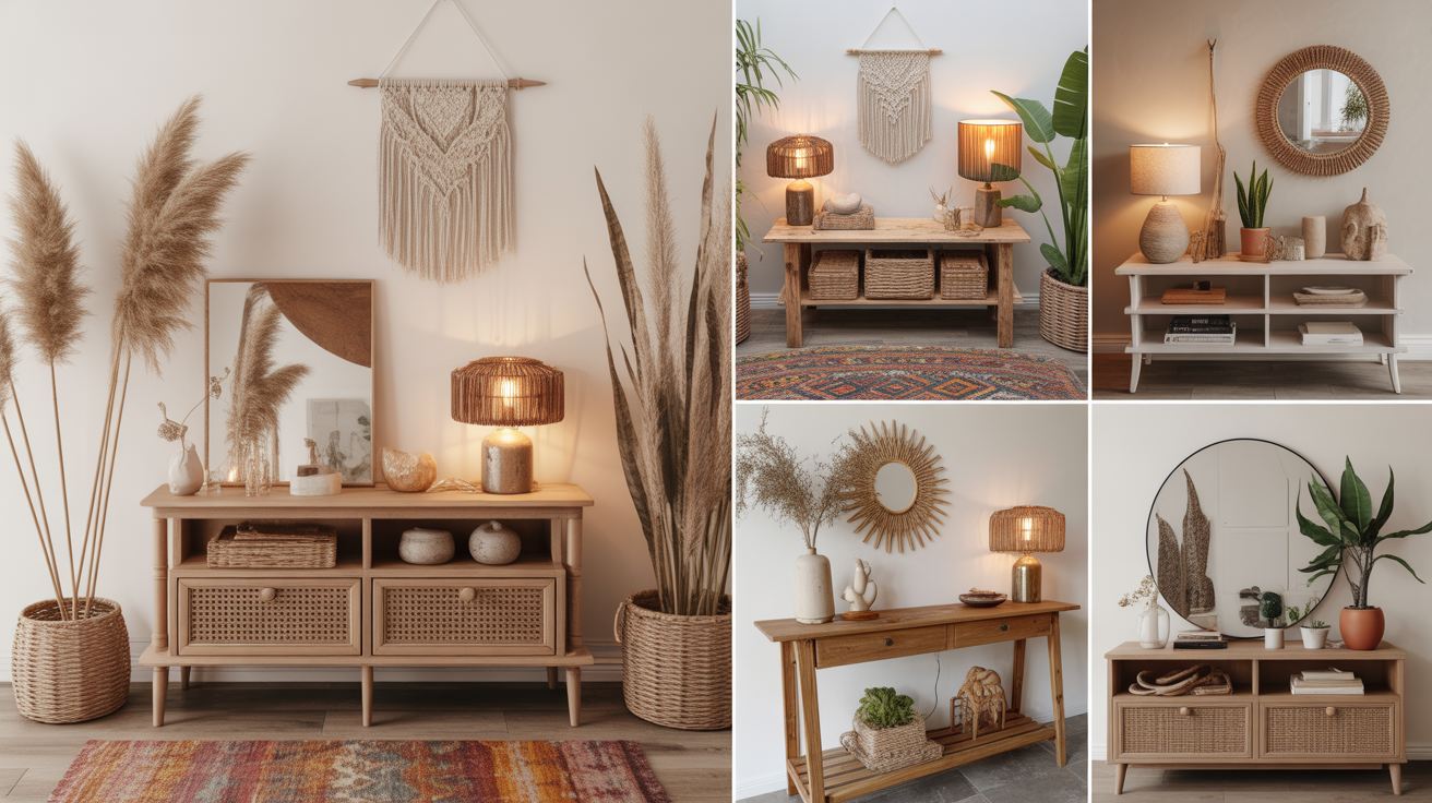
Do you want your living room to feel warm, grounded, and effortlessly inviting? Earthy living room color ideas are a wonderful way to bring that natural, calming feeling into your home using tones inspired by clay, stone, wood, and greenery. These colors work together to create a space that feels balanced rather than overwhelming, no matter the size of the room. They also pair beautifully with natural materials like wood, linen, and rattan for a cohesive, lived-in look.
Whether you are repainting an entire room or simply rethinking your color palette through accents and furniture, these twenty ideas offer plenty of inspiration. From deep terracottas to soft sages and warm taupes, each shade brings its own character while still feeling connected to nature. Let us explore the most beautiful earthy color combinations to bring calm and warmth into your living room.
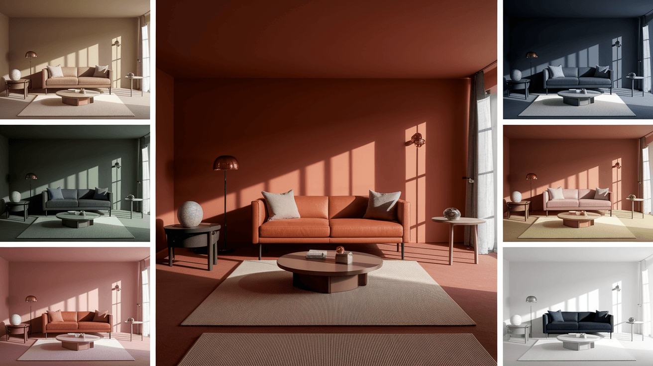
1. Warm Terracotta Walls
Terracotta is one of the most recognizable earthy tones, bringing a warm, sun-baked feeling to any living room. This reddish-orange hue works beautifully as a full accent wall or layered throughout the room in smaller doses, like cushions or pottery. It pairs especially well with cream, white, and natural wood tones, creating a balanced contrast that feels both bold and grounded. Terracotta also tends to look richer in rooms with plenty of natural light.
Using terracotta on just one wall keeps the look from feeling too heavy, while still making a strong visual statement. Adding woven textures, like a jute rug or rattan chair, enhances the earthy feel even further. This color works well in both modern and traditional living room styles.
Best For: Accent walls, cushions, and pottery accents.
Pro Tip: Pair terracotta with cream for balanced warmth.
2. Soft Sage Green
Sage green is a gentle, muted shade that brings a calming, garden-inspired feel to a living room. Unlike brighter greens, sage feels soft and grounded, making it easy to pair with almost any other earthy tone. This color works beautifully on walls, sofas, or even kitchen cabinetry that opens into the living space. It also complements natural wood furniture without competing for attention.
Pairing sage green with warm neutrals, like beige or soft brown, creates a soothing, nature-inspired palette throughout the room. Adding houseplants enhances this green tone even further, tying the color scheme directly to the natural world. Sage green also tends to feel timeless, making it a safe long-term choice.
Best For: Walls, sofas, and cabinetry.
Pro Tip: Combine sage green with houseplants for cohesion.
3. Rich Clay Brown
Clay brown brings a deep, grounding warmth that feels both sophisticated and cozy in a living room setting. This color works especially well on larger furniture pieces, like sofas or armchairs, where it can anchor the room without overwhelming the walls. It also pairs beautifully with lighter earthy tones, like cream or oatmeal, for a balanced contrast. Clay brown tends to feel especially inviting in rooms used for relaxing or gathering.
Using clay brown in textiles, such as curtains or throw blankets, adds warmth without requiring a full repaint. This tone also works well alongside metal accents in brass or copper for added richness. The depth of clay brown makes it a strong, grounding choice for any earthy palette.
Best For: Sofas, curtains, and armchairs.
Pro Tip: Add brass accents to enhance clay brown tones.
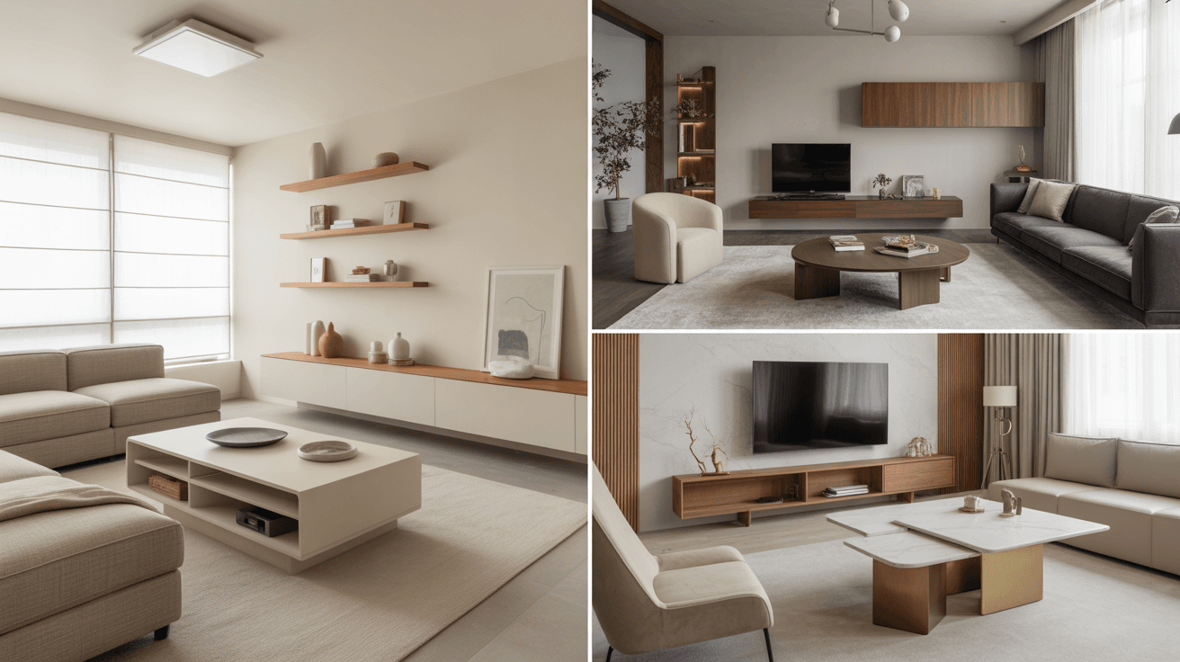
4. Warm Beige and Sand Tones
Beige and sand tones form the foundation of many earthy living room palettes, offering a soft, neutral backdrop that feels warm rather than stark. These shades work well on walls, large furniture pieces, or flooring, providing a versatile base for layering other earthy colors. Unlike cooler grays, warm beige tends to feel inviting and timeless. This makes it an easy starting point for any earthy color scheme.
Layering different shades of beige and sand through textiles, like cushions, throws, and rugs, adds depth without introducing new colors. This tonal approach creates a calm, cohesive look that feels intentional and well put together. Beige also acts as a perfect canvas for bolder earthy accents, like terracotta or olive green.
Best For: Walls, flooring, and large furniture.
Pro Tip: Layer multiple beige tones for added depth.
5. Deep Olive Green
Olive green is a richer, more muted shade of green that brings sophistication and warmth to a living room. This color works particularly well on accent walls, upholstered furniture, or even window treatments, where it can make a noticeable impact. Olive pairs beautifully with warm woods, brass accents, and cream textiles for a balanced, grounded look. It also tends to feel less trendy and more timeless compared to brighter green shades.
Using olive green in smaller doses, like a single armchair or set of curtains, allows you to experiment with the color without a major commitment. This shade also works well in rooms with plenty of natural light, where it can feel rich without becoming too dark. Olive green pairs especially well with terracotta and warm beige tones.
Best For: Accent walls, upholstery, and curtains.
Pro Tip: Pair olive green with warm wood furniture.
6. Natural Stone Gray
Stone gray offers a softer alternative to traditional cool grays, leaning slightly warmer and pairing beautifully with earthy tones. This shade works well as a wall color, providing a neutral backdrop that lets other earthy elements stand out. It also pairs nicely with natural materials, like linen, wood, and woven textures, for a balanced overall look. Stone gray tends to feel calm and understated, making it a versatile choice for any living room.
Combining stone gray walls with warm wood furniture and soft textiles prevents the room from feeling too cool or sterile. Adding a few terracotta or olive accents introduces warmth and contrast against the neutral backdrop. This combination feels both modern and grounded at the same time.
Best For: Walls, flooring, and large surfaces.
Pro Tip: Balance stone gray with warm wood tones.
7. Mustard Yellow Accents
Mustard yellow brings a warm, slightly muted pop of color that works beautifully within an earthy palette. This shade feels less bright than traditional yellow, making it easier to incorporate without overwhelming the space. Mustard works well in smaller doses, like throw pillows, artwork, or a single accent chair. It pairs particularly well with deep browns, olive greens, and warm neutrals.
Using mustard sparingly helps maintain the calm, grounded feeling of an earthy living room while still adding visual interest. This color also tends to feel especially cozy during colder months, making it a great choice for year-round warmth. Mustard accents work well alongside natural textures, like wool or linen.
Best For: Throw pillows, artwork, and accent chairs.
Pro Tip: Use mustard sparingly to avoid overwhelming the space.
8. Warm Charcoal and Espresso
Deep, warm charcoal or espresso tones add depth and grounding to an earthy living room palette. These darker shades work especially well on furniture, like coffee tables or media units, where they can anchor the room visually. Unlike cooler blacks, warm charcoal tends to feel softer and more inviting. This tone pairs beautifully with lighter earthy colors, like sand or sage, for balanced contrast.
Using espresso tones on smaller furniture pieces or frames helps define the space without making it feel too dark overall. This color also works well alongside metallic accents, like brass or copper, which add warmth and shine. Warm charcoal grounds a room while still feeling approachable.
Best For: Furniture, frames, and accent pieces.
Pro Tip: Pair dark tones with brass for added warmth.
9. Soft Camel and Tan
Camel and tan tones bring a warm, sophisticated feel to a living room, often associated with leather furniture or woven textiles. These shades work beautifully as upholstery colors, providing a rich but neutral base that pairs with almost any other earthy tone. Camel tends to feel timeless and works well in both modern and traditional spaces. It also tends to age gracefully, making it a practical long-term choice for furniture.
Pairing camel with cream walls and wood furniture creates a cohesive, warm palette throughout the room. Adding texture through woven baskets or knit throws enhances the natural feel of this color combination. Camel also pairs nicely with deeper browns for added contrast.
Best For: Sofas, armchairs, and leather accents.
Pro Tip: Combine camel with woven textures for warmth.
10. Dusty Rose and Clay Pink
Dusty rose and clay pink bring a soft, muted warmth that fits naturally within an earthy color scheme. Unlike brighter pinks, these tones feel grounded and sophisticated, making them easy to pair with browns, greens, and neutrals. This color works well on accent walls, cushions, or even upholstered furniture for a subtle pop of color. It adds a gentle warmth without feeling overly feminine or bright.
Pairing dusty rose with sage green or olive creates a balanced, nature-inspired combination that feels fresh and calming. Using this tone in smaller accents, like throw pillows or artwork, allows for easy experimentation. Dusty rose also pairs beautifully with warm wood tones for added cohesion.
Best For: Cushions, accent walls, and artwork.
Pro Tip: Pair dusty rose with sage green accents.
11. Warm Cream and Ivory
Warm cream and ivory tones provide a soft, inviting base for an earthy living room palette. These shades feel brighter than beige while still maintaining warmth, making them ideal for walls, ceilings, or large furniture pieces. Cream tends to reflect light beautifully, helping smaller rooms feel more open and airy. This tone also acts as a versatile backdrop for layering bolder earthy colors.
Using cream alongside natural wood and woven textures creates a soft, organic feel throughout the room. Adding deeper earthy accents, like terracotta or olive, against a cream backdrop creates beautiful contrast. This combination feels both calming and visually interesting.
Best For: Walls, ceilings, and large furniture.
Pro Tip: Use cream as a base for layering other tones.
12. Burnt Orange Highlights
Burnt orange adds a bold, warm accent within an earthy color scheme without feeling out of place. This shade works particularly well in smaller doses, like throw pillows, vases, or artwork, where it can stand out against more neutral tones. Burnt orange pairs beautifully with deep browns, olive greens, and warm creams. It also tends to feel especially cozy during autumn and winter months.
Using burnt orange as an accent color allows you to experiment with bold tones while keeping the overall palette grounded. This shade works well alongside natural materials, like wood and ceramic, for added texture. A little burnt orange goes a long way in adding warmth and personality.
Best For: Pillows, vases, and artwork.
Pro Tip: Use burnt orange in small, intentional accents.
13. Muted Forest Green
Muted forest green brings a deep, calming presence to a living room, often used on accent walls or larger furniture pieces. This shade feels rich without being overly dark, especially when paired with lighter earthy tones like cream or tan. Forest green pairs beautifully with natural wood and brass accents for a balanced, grounded look. It also tends to feel especially cozy in rooms with plenty of soft lighting.
Using forest green on a single wall or large sofa creates a strong focal point without overwhelming the space. Pairing this shade with warm neutrals prevents the room from feeling too dark or heavy. Forest green also works well alongside botanical prints or houseplants for added cohesion.
Best For: Accent walls, sofas, and large furniture.
Pro Tip: Balance forest green with warm neutral tones.
14. Soft Putty and Greige
Putty and greige tones combine the warmth of beige with the softness of gray, creating a versatile neutral base for an earthy palette. These shades work well on walls, providing a backdrop that feels neither too warm nor too cool. Putty pairs beautifully with both lighter and darker earthy accents, making it an easy starting point for color planning. This tone also tends to feel calming and understated.
Using putty walls alongside natural wood furniture and woven textures creates a balanced, grounded look. Adding pops of color, like terracotta or olive, against this neutral backdrop introduces warmth and interest. Putty tones also tend to photograph well, making them popular for many home styles.
Best For: Walls, trim, and large surfaces.
Pro Tip: Use putty tones as a flexible neutral base.
15. Warm Copper and Bronze Accents
Copper and bronze tones add a metallic warmth that complements earthy color palettes beautifully. These accents work well in smaller details, like lamps, frames, or decorative bowls, adding shine without feeling too bold. Copper pairs particularly well with deep browns, terracotta, and olive green. This combination creates a rich, layered look that feels both warm and sophisticated.
Using copper accents sparingly throughout the room helps tie different earthy tones together visually. These metallic touches also catch light beautifully, adding subtle warmth to the overall space. Copper and bronze work well in both modern and traditional living room styles.
Best For: Lamps, frames, and decorative accents.
Pro Tip: Add copper accents to tie earthy tones together.
16. Soft Taupe Walls
Taupe is a warm, grayish-brown tone that works beautifully as a wall color in an earthy living room. This shade feels neutral enough to pair with almost any other earthy color while still adding warmth compared to traditional gray. Taupe walls provide a calm, understated backdrop that lets furniture and accents take center stage. This tone also tends to feel timeless, making it a safe long-term choice.
Pairing taupe walls with cream or beige furniture creates a soft, monochromatic look that feels calming and cohesive. Adding deeper accents, like clay brown or olive green, introduces contrast without disrupting the overall balance. Taupe works well in both small and large living rooms.
Best For: Walls, trim, and ceilings.
Pro Tip: Pair taupe walls with cream furniture for balance.
17. Warm Khaki Tones
Khaki brings a soft, muted green-brown tone that fits naturally within an earthy color scheme. This shade works well on upholstery, curtains, or even walls, providing a grounded base that pairs easily with other natural tones. Khaki feels less formal than traditional beige while still maintaining a neutral, versatile quality. It also tends to hide wear well, making it practical for high-traffic furniture.
Pairing khaki with cream, terracotta, or olive green creates a balanced, nature-inspired palette. This tone also works well alongside natural materials, like linen or jute, for added texture. Khaki feels both relaxed and grounded, making it ideal for everyday living spaces.
Best For: Upholstery, curtains, and walls.
Pro Tip: Pair khaki with natural linen textures.
18. Deep Plum and Aubergine
Deep plum and aubergine tones add a rich, unexpected warmth to an earthy living room palette. These shades work particularly well in smaller doses, like accent chairs, cushions, or artwork, where they can add depth without overwhelming the space. Plum pairs beautifully with warm browns, mustard, and cream tones. This combination feels sophisticated while still maintaining an earthy, grounded quality.
Using plum sparingly helps maintain balance within the overall color scheme. This tone also works well in rooms with warm lighting, where it can feel rich rather than heavy. Plum accents add a touch of depth and personality to an otherwise neutral palette.
Best For: Accent chairs, cushions, and artwork.
Pro Tip: Use plum tones sparingly for added depth.
19. Natural Linen White
Linen white is a soft, warm white tone that feels more inviting than stark white, making it ideal for earthy living rooms. This shade works well on walls, trim, or ceilings, providing a bright but cozy backdrop. Linen white pairs beautifully with natural materials, like wood, jute, and woven textiles, enhancing their texture rather than competing with it. This tone also helps smaller rooms feel more open and airy.
Combining linen white walls with warm wood furniture and earthy accents creates a balanced, calming look. Adding texture through textiles and natural materials prevents the space from feeling too plain. Linen white serves as an excellent base for layering bolder earthy tones.
Best For: Walls, trim, and ceilings.
Pro Tip: Pair linen white with natural wood textures.
20. Warm Chocolate Brown
Chocolate brown brings a deep, rich warmth that works beautifully as an anchor color within an earthy living room palette. This shade is especially effective on large furniture pieces, like sofas or sectionals, where it can ground the room visually. Chocolate brown pairs well with lighter earthy tones, like cream, tan, or sage, for balanced contrast. It also tends to feel especially cozy in larger rooms.
Using chocolate brown furniture against lighter walls prevents the room from feeling too dark overall. Adding texture through textiles, like wool throws or woven baskets, enhances the warmth of this tone. Chocolate brown feels both grounding and inviting, making it a strong choice for gathering spaces.
Best For: Sofas, sectionals, and large furniture.
Pro Tip: Pair chocolate brown with lighter wall tones.
Final Thoughts
Earthy living room color ideas offer a flexible, timeless way to bring warmth and balance into any home. Whether you choose a single bold accent color or layer several muted tones together, these shades work in harmony to create a space that feels calm, grounded, and welcoming. Start with one or two colors that resonate with you, then build your palette gradually through furniture, textiles, and accents. A thoughtfully chosen earthy palette can transform the entire feel of a living room without requiring a complete redesign.
We hope these color ideas inspired you to think differently about your living room palette. Small color changes can make a big difference in how a space feels day to day. For more home inspiration, visit us at TrendyDecorGuide.com.