20 Serene Living Room Color Ideas for a Calm, Peaceful Home
Introduction
Have you ever wished your living room felt like a quiet escape from the chaos of everyday life? That’s exactly what serene living room color ideas can offer, transforming a busy space into a calm sanctuary. Serene colors have a gentle, soothing quality that helps slow down the pace and create a sense of peace the moment you walk through the door. If your living room feels too stimulating or cluttered with color, a calmer palette could make all the difference.
In this post, you’re going to discover twenty peaceful color ideas that bring tranquility and calm into your living room. From soft watery blues to gentle stone neutrals and quiet sage greens, each idea is designed to create a soothing, restful atmosphere. You’ll find inspiration that works for busy family homes, quiet reading rooms, and everything in between. Get ready to fall in love with colors that help you finally relax.
1. Misty Blue-Gray Walls
Misty blue-gray is one of the most calming colors you can bring into a living room, evoking the quiet stillness of an early morning fog. This soft shade works beautifully on walls, creating a serene backdrop that doesn’t compete with the rest of the room. Blue-gray pairs wonderfully with white, soft beige, and natural wood for a peaceful, balanced look. It’s a color that instantly slows down the energy of a space.
To enhance the calming effect, pair misty blue-gray with soft textiles like linen curtains and wool throws. Adding plenty of natural light helps this shade feel airy rather than dull or heavy. This combination works especially well in living rooms meant for quiet evenings or reading. Misty blue-gray is a timeless choice for anyone seeking a peaceful retreat at home.
Best For: Reading rooms, quiet living rooms, and bedrooms-turned-lounges
Pro Tip: Pair blue-gray with soft linen textures.
2. Soft Stone Gray Neutrals
Soft stone gray is a gentle, grounding neutral that creates an instantly calming foundation for a living room. This shade works beautifully on walls, sofas, or area rugs, providing a quiet backdrop for the rest of the space. Stone gray pairs wonderfully with cream, soft blue, and natural wood for a serene, layered palette. It’s a color that feels both modern and timeless without ever feeling cold.
This shade works especially well in living rooms with minimalist or Scandinavian design styles, where calm neutrals create a peaceful base. Pairing stone gray with soft textures like wool and linen enhances the cozy, serene feel. Adding a few plants brings a touch of life without disrupting the calm. Soft stone gray neutrals are perfect for anyone who wants their living room to feel quietly restful.
Best For: Minimalist homes, Scandinavian apartments, and meditation spaces
Pro Tip: Add plants to soften gray’s coolness.
3. Pale Eucalyptus Green
Pale eucalyptus green brings a soft, natural calm to a living room, evoking the quiet feeling of a forest walk. This gentle shade works beautifully as an accent wall or through soft furnishings like curtains and pillows. Eucalyptus green pairs wonderfully with cream, soft gray, and warm wood for a peaceful, nature-inspired palette. It’s a color that feels both fresh and deeply calming.
This shade works especially well in living rooms with a quiet, nature-focused design style, where soft greens feel completely at home. Pairing eucalyptus green with plenty of natural light enhances its soft, soothing quality. Adding wooden furniture grounds the space and reinforces the natural feel. Pale eucalyptus green is perfect for anyone who wants their living room to feel like a peaceful retreat.
Best For: Nature-inspired homes, reading nooks, and quiet family rooms
Pro Tip: Pair eucalyptus green with natural light.
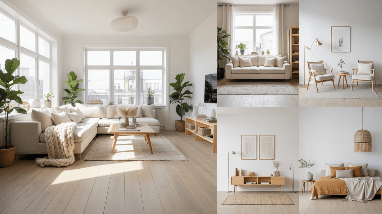
4. Soft Cloud White
Soft cloud white is a gentle, warm-toned white that creates an open, peaceful feeling in any living room. Unlike stark white, this shade has subtle warmth that keeps the space from feeling sterile or cold. Cloud white works beautifully on walls, ceilings, and trim, helping a room feel larger and more serene. It pairs wonderfully with soft grays, gentle blues, and warm wood for a calm, airy look.
This shade works especially well in living rooms that need to feel more open and peaceful, especially smaller spaces. Pairing cloud white with soft, neutral textiles keeps the room feeling light without being boring. Adding a few calming accents, like soft greenery or simple artwork, enhances the serene atmosphere. Soft cloud white is perfect for anyone who wants their living room to feel light, airy, and calm.
Best For: Small living rooms, minimalist homes, and meditation corners
Pro Tip: Use cloud white to make rooms feel larger.
5. Gentle Lavender Mist
Gentle lavender mist is a soft, soothing shade that brings a quiet, spa-like calm to a living room. This pale color works beautifully through accent walls, curtains, or soft furnishings without feeling overwhelming. Lavender mist pairs wonderfully with soft gray, cream, and muted green for a peaceful, balanced palette. It’s a color that feels gentle and calming without being too sweet or feminine.
This shade works especially well in living rooms designed for relaxation, such as a quiet corner for reading or unwinding after work. Pairing lavender mist with soft lighting enhances its calming, dreamy quality in the evening. Adding natural wood tones helps ground the color and keep the space feeling balanced. Gentle lavender mist is perfect for anyone who wants their living room to feel like a peaceful escape.
Best For: Reading corners, spa-inspired homes, and quiet lounges
Pro Tip: Use soft lighting to enhance lavender’s calm.
6. Soft Sage Green Walls
Soft sage green is one of the most popular serene colors because it brings the calming presence of nature indoors. This muted green shade works beautifully on walls, creating a peaceful, grounded backdrop for the entire room. Sage green pairs wonderfully with cream, soft gray, and warm wood tones for a balanced, natural palette. It’s a color that feels calming in any season and any lighting.
This shade works especially well in living rooms with a relaxed, nature-inspired design style, where soft greens feel completely at home. Pairing sage green with linen textiles enhances the soft, organic feel of the space. Adding plenty of plants reinforces the calming, natural atmosphere even further. Soft sage green walls are perfect for anyone who wants their living room to feel peacefully connected to nature.
Best For: Nature-inspired homes, family rooms, and quiet retreats
Pro Tip: Pair sage green with linen for softness.
7. Quiet Oatmeal Neutrals
Quiet oatmeal is a soft, warm neutral that brings a calm, cozy feeling to a living room without any boldness. This gentle shade works beautifully on sofas, rugs, or curtains, creating a peaceful foundation for the space. Oatmeal pairs wonderfully with cream, soft brown, and pale blue for a serene, layered look. It’s a color that feels comforting and calm at the same time.
This shade works especially well in living rooms with minimalist or Japandi design styles, where quiet neutrals create a peaceful base. Pairing oatmeal with natural textures like linen and wool enhances the calm, cozy feel. Adding soft, indirect lighting reinforces the relaxed atmosphere in the evening. Quiet oatmeal neutrals are perfect for anyone who wants their living room to feel gently soothing.
Best For: Japandi homes, minimalist apartments, and quiet family rooms
Pro Tip: Add soft, indirect lighting for calm evenings.
8. Pale Aqua Touches
Pale aqua brings a soft, watery calm to a living room, evoking the quiet feeling of a still lake or gentle shoreline. This gentle shade works beautifully through accent pillows, curtains, or a single piece of furniture. Aqua pairs wonderfully with white, soft gray, and natural wood for a peaceful, coastal-inspired palette. It’s a color that feels refreshing without being too bold or bright.
This shade works especially well in living rooms with a coastal or relaxed design style, where soft blues feel completely natural. A little pale aqua goes a long way, so consider using it through smaller accessories rather than large furniture pieces. Pairing aqua with plenty of white space keeps the room feeling calm and uncluttered. Pale aqua touches are perfect for anyone who wants their living room to feel quietly refreshing.
Best For: Coastal homes, sunrooms, and relaxed family rooms
Pro Tip: Use aqua sparingly for a calm accent.
9. Soft Taupe Foundations
Soft taupe is a quiet, warm-toned neutral that creates a calm, grounded foundation for any living room. This gentle shade works beautifully on walls, furniture, or flooring, providing a peaceful backdrop for the rest of the space. Taupe pairs wonderfully with cream, soft blue, and warm wood for a serene, balanced palette. It’s a color that feels calm and sophisticated without ever feeling cold.
This shade works especially well in living rooms with transitional or minimalist design styles, where quiet neutrals create a peaceful base. Pairing soft taupe with natural textures like linen and wool enhances the calm, cozy feel. Adding a few soft greenery accents brings life to the space without disrupting the calm. Soft taupe foundations are perfect for anyone who wants their living room to feel quietly elegant.
Best For: Transitional homes, minimalist apartments, and quiet living rooms
Pro Tip: Pair taupe with soft greenery accents.
10. Gentle Powder Blue
Gentle powder blue brings a soft, peaceful calm to a living room, evoking the quiet feeling of a clear sky at dawn. This pale shade works beautifully through accent walls, curtains, or soft furnishings without feeling overwhelming. Powder blue pairs wonderfully with white, soft gray, and natural wood for a serene, balanced palette. It’s a color that feels gentle and calming in any season.
This shade works especially well in living rooms designed for relaxation, where soft blues create a peaceful, restful atmosphere. Pairing powder blue with soft lighting enhances its calming quality in the evening. Adding natural textures like linen and wool helps ground the color and keep the space feeling warm. Gentle powder blue is perfect for anyone who wants their living room to feel calm and serene.
Best For: Reading rooms, quiet lounges, and relaxed family homes
Pro Tip: Pair powder blue with natural textures.
11. Soft Dove Gray
Soft dove gray is a gentle, quiet neutral that creates a calm, sophisticated foundation for any living room. This shade works beautifully on walls, sofas, or curtains, providing a peaceful backdrop for the rest of the space. Dove gray pairs wonderfully with cream, soft blue, and warm wood for a serene, balanced palette. It’s a color that feels calm and elegant without ever feeling stark.
This shade works especially well in living rooms with minimalist or transitional design styles, where quiet neutrals create a peaceful base. Pairing dove gray with soft textiles like linen and wool enhances the calm, cozy feel. Adding warm lighting in the evening softens the coolness of this shade beautifully. Soft dove gray is perfect for anyone who wants their living room to feel quietly calm.
Best For: Minimalist homes, transitional apartments, and quiet retreats
Pro Tip: Add warm lighting to soften gray’s coolness.
12. Calm Seafoam Green
Calm seafoam green brings a soft, watery serenity to a living room, evoking the quiet feeling of gentle ocean waves. This pale shade works beautifully through accent walls, pillows, or soft furnishings. Seafoam pairs wonderfully with white, soft gray, and natural wood for a peaceful, coastal-inspired palette. It’s a color that feels both calming and refreshing at the same time.
This shade works especially well in living rooms with a relaxed or coastal design style, where soft greens and blues feel completely natural. A little seafoam goes a long way, so consider using it through smaller accessories rather than large furniture pieces. Pairing seafoam with plenty of natural light enhances its soft, calming quality. Calm seafoam green is perfect for anyone who wants their living room to feel like a quiet retreat.
Best For: Coastal homes, sunrooms, and relaxed living rooms
Pro Tip: Pair seafoam with plenty of natural light.
13. Soft Putty Beige
Soft putty beige is a quiet, warm-toned neutral that creates a calm, understated foundation for a living room. This gentle shade works beautifully on walls, furniture, or rugs, providing a peaceful backdrop for the rest of the space. Putty beige pairs wonderfully with cream, soft gray, and warm wood for a serene, layered palette. It’s a color that feels calm and grounded without ever feeling boring.
This shade works especially well in living rooms with minimalist or Japandi design styles, where quiet neutrals create a peaceful base. Pairing putty beige with natural textures like linen and jute enhances the calm, organic feel. Adding soft, indirect lighting reinforces the relaxed atmosphere in the evening. Soft putty beige is perfect for anyone who wants their living room to feel gently soothing.
Best For: Japandi homes, minimalist apartments, and quiet retreats
Pro Tip: Pair putty beige with natural jute textures.
14. Pale Periwinkle Whispers
Pale periwinkle is a soft, dreamy shade that brings a gentle calm to a living room without feeling too bold. This delicate color works beautifully through accent walls, curtains, or soft furnishings. Periwinkle pairs wonderfully with white, soft gray, and natural wood for a peaceful, balanced palette. It’s a color that feels soft and soothing in any lighting.
This shade works especially well in living rooms designed for relaxation, where soft blue-purples create a quiet, restful atmosphere. Pairing periwinkle with soft lighting enhances its calming quality in the evening. Adding natural textures like linen and wool helps ground the color and keep the space feeling warm. Pale periwinkle whispers are perfect for anyone who wants their living room to feel softly serene.
Best For: Reading rooms, quiet lounges, and relaxed bedrooms-turned-living-rooms
Pro Tip: Use soft lighting to enhance periwinkle’s calm.
15. Soft Sand Neutrals
Soft sand is a warm, quiet neutral that brings the calming feeling of a quiet beach into a living room. This gentle shade works beautifully on walls, sofas, or rugs, providing a peaceful foundation for the space. Sand pairs wonderfully with cream, soft blue, and natural wood for a serene, coastal-inspired palette. It’s a color that feels calm and grounded without ever feeling cold.
This shade works especially well in living rooms with coastal or relaxed design styles, where soft neutrals feel completely natural. Pairing soft sand with natural textures like linen and rattan enhances the calm, organic feel. Adding plenty of natural light reinforces the peaceful, beachy atmosphere. Soft sand neutrals are perfect for anyone who wants their living room to feel like a quiet shoreline retreat.
Best For: Coastal homes, relaxed family rooms, and sunrooms
Pro Tip: Pair sand tones with natural rattan textures.
16. Gentle Mint Whispers
Gentle mint is a soft, cool shade that brings a quiet freshness to a living room without feeling too bright. This pale color works beautifully through accent pillows, curtains, or soft furnishings. Mint pairs wonderfully with white, soft gray, and natural wood for a peaceful, balanced palette. It’s a color that feels calming and fresh at the same time.
This shade works especially well in living rooms designed for relaxation, where soft greens create a quiet, restful atmosphere. A little gentle mint goes a long way, so consider using it through smaller accessories rather than large furniture pieces. Pairing mint with plenty of natural light enhances its soft, calming quality. Gentle mint whispers are perfect for anyone who wants their living room to feel softly refreshing.
Best For: Reading nooks, relaxed family rooms, and quiet apartments
Pro Tip: Use mint sparingly for a calm accent.
17. Soft Pebble Gray
Soft pebble gray is a quiet, warm-toned gray that creates a calm, grounded foundation for a living room. This gentle shade works beautifully on walls, furniture, or flooring, providing a peaceful backdrop for the rest of the space. Pebble gray pairs wonderfully with cream, soft blue, and warm wood for a serene, layered palette. It’s a color that feels calm and modern without ever feeling cold.
This shade works especially well in living rooms with minimalist or Scandinavian design styles, where quiet neutrals create a peaceful base. Pairing pebble gray with natural textures like linen and wool enhances the calm, cozy feel. Adding a few plants brings life to the space without disrupting the calm. Soft pebble gray is perfect for anyone who wants their living room to feel quietly modern.
Best For: Scandinavian homes, minimalist apartments, and quiet retreats
Pro Tip: Add plants to soften pebble gray’s coolness.
18. Pale Blush Whispers
Pale blush is a soft, gentle shade that brings a quiet warmth to a living room without feeling too bold. This delicate color works beautifully through accent walls, curtains, or soft furnishings. Blush pairs wonderfully with cream, soft gray, and natural wood for a peaceful, balanced palette. It’s a color that feels soft and soothing in any lighting.
This shade works especially well in living rooms designed for relaxation, where soft pinks create a quiet, restful atmosphere. Pairing pale blush with soft lighting enhances its calming quality in the evening. Adding natural textures like linen and wool helps ground the color and keep the space feeling warm. Pale blush whispers are perfect for anyone who wants their living room to feel gently serene.
Best For: Reading corners, quiet lounges, and relaxed bedrooms-turned-living-rooms
Pro Tip: Use soft lighting to enhance blush’s calm.
19. Quiet Slate Blue
Quiet slate blue is a soft, muted shade that brings a calm, grounded feeling to a living room. This gentle color works beautifully as an accent wall or through soft furnishings like curtains and pillows. Slate blue pairs wonderfully with cream, soft gray, and warm wood for a serene, balanced palette. It’s a color that feels calm and quietly sophisticated.
This shade works especially well in living rooms with minimalist or transitional design styles, where muted blues create a peaceful atmosphere. Pairing slate blue with natural textures like linen and wool enhances the calm, cozy feel. Adding soft, warm lighting in the evening balances the coolness of this shade. Quiet slate blue is perfect for anyone who wants their living room to feel calmly grounded.
Best For: Minimalist homes, transitional apartments, and quiet retreats
Pro Tip: Balance slate blue with warm evening lighting.
20. Layered Soft Neutrals
Layered soft neutrals combine gentle shades like cream, oatmeal, soft gray, and pale beige for a calm, textured living room. This approach works beautifully by mixing different soft tones throughout furniture, rugs, and accessories. Layered neutrals pair wonderfully with natural materials like linen, wool, and wood for an effortlessly serene look. It’s a color approach that feels timeless and endlessly peaceful.
This idea works especially well in living rooms with Japandi or Scandinavian design styles, where soft neutrals create a calming foundation. Mixing textures like knit throws, woven baskets, and wood furniture adds gentle depth to the layered look. Keeping accents minimal preserves the quiet, restful feeling of the space. Layered soft neutrals are perfect for anyone who wants their living room to feel like a peaceful sanctuary.
Best For: Japandi homes, Scandinavian apartments, and quiet sanctuaries
Pro Tip: Keep accents minimal for a restful feel.
Final Thoughts
These twenty serene living room color ideas prove that creating a calm, peaceful space is all about choosing colors that quiet the mind rather than excite it. Whether you’re drawn to soft blues, gentle greens, or layered neutrals, there’s a palette here to help your living room feel like a true sanctuary. The best part about serene colors is how easily they work together, allowing you to layer soft tones until the space feels just right. Don’t be afraid to combine a few of these ideas for a living room that feels deeply restful and uniquely yours.
Now it’s time to bring some of this calm energy into your own living room and start decorating with intention. Pick one or two ideas that feel most peaceful to you and use them as your starting point for a more serene home. For more calming nd peaceful decor inspiration, visit us at Trendy Decor Guide.