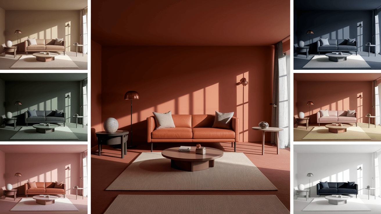
20 Bright Living Room Color Ideas That Make You Feel Happy
Color has the power to transform how we feel, and nowhere is that more true than in the living room—the heart of the home. Choosing the right bright and joyful hues can lift your mood, energize your space, and create a welcoming atmosphere for you and your guests.
Whether you’re into bold citrus tones, soothing sky blues, or sun-warmed pastels, this guide explores 20 bright living room color ideas that radiate cheer. Let’s dive into a world of light, color, and design that will make you smile every time you walk in the door.
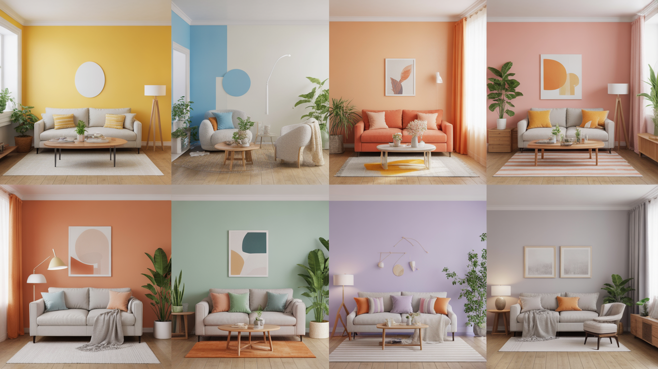
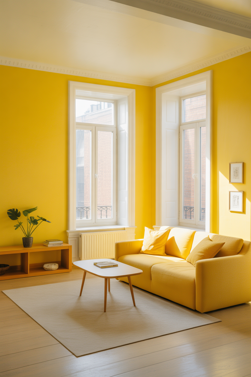
1. Sunny Yellow Walls
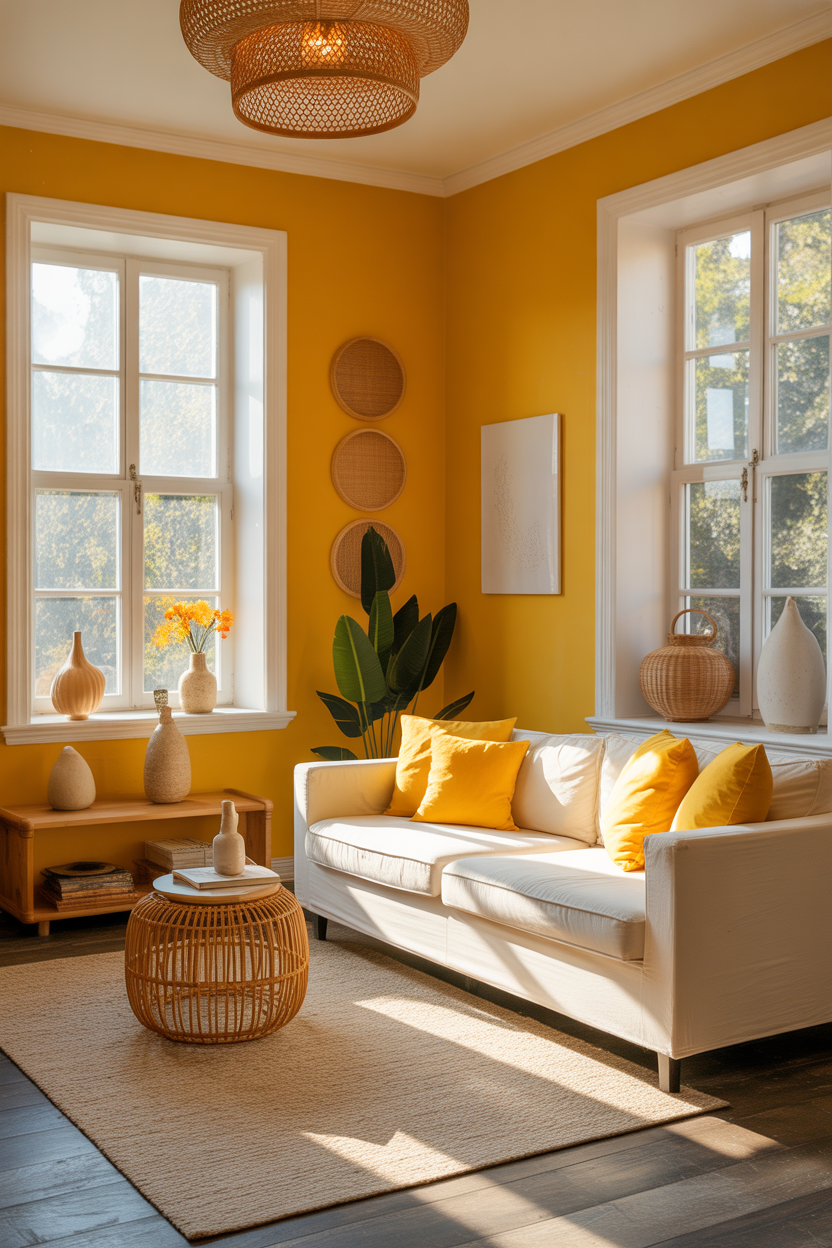
Few colors feel as optimistic as bright yellow. A sunny hue on your living room walls can energize the entire space, making it feel warm, open, and full of positive energy. It’s like a splash of sunshine, even on a cloudy day.
Pair it with white trim, rattan accents, and natural textures to balance its vibrancy. For smaller rooms, choose soft lemon or marigold tones to avoid overwhelming the space.
Best For: Small to midsize living rooms that need a dose of natural light and joy.
Pro Tip: Use matte finishes to soften the brightness and reduce glare from natural light.
2. Sky Blue with White Accents
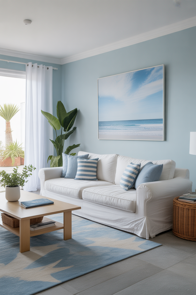
Sky blue evokes a sense of calm and optimism, just like a clear day. When paired with white trim or furnishings, it creates a coastal vibe that’s fresh and clean, yet delightfully cheerful.
This combination works beautifully in both traditional and modern spaces, making the room feel more expansive while subtly uplifting your mood.
Best For: Beach-inspired or airy interiors that aim to feel relaxed and breathable.
Pro Tip: Mix in pale wood or woven textures to add warmth and avoid a clinical look.
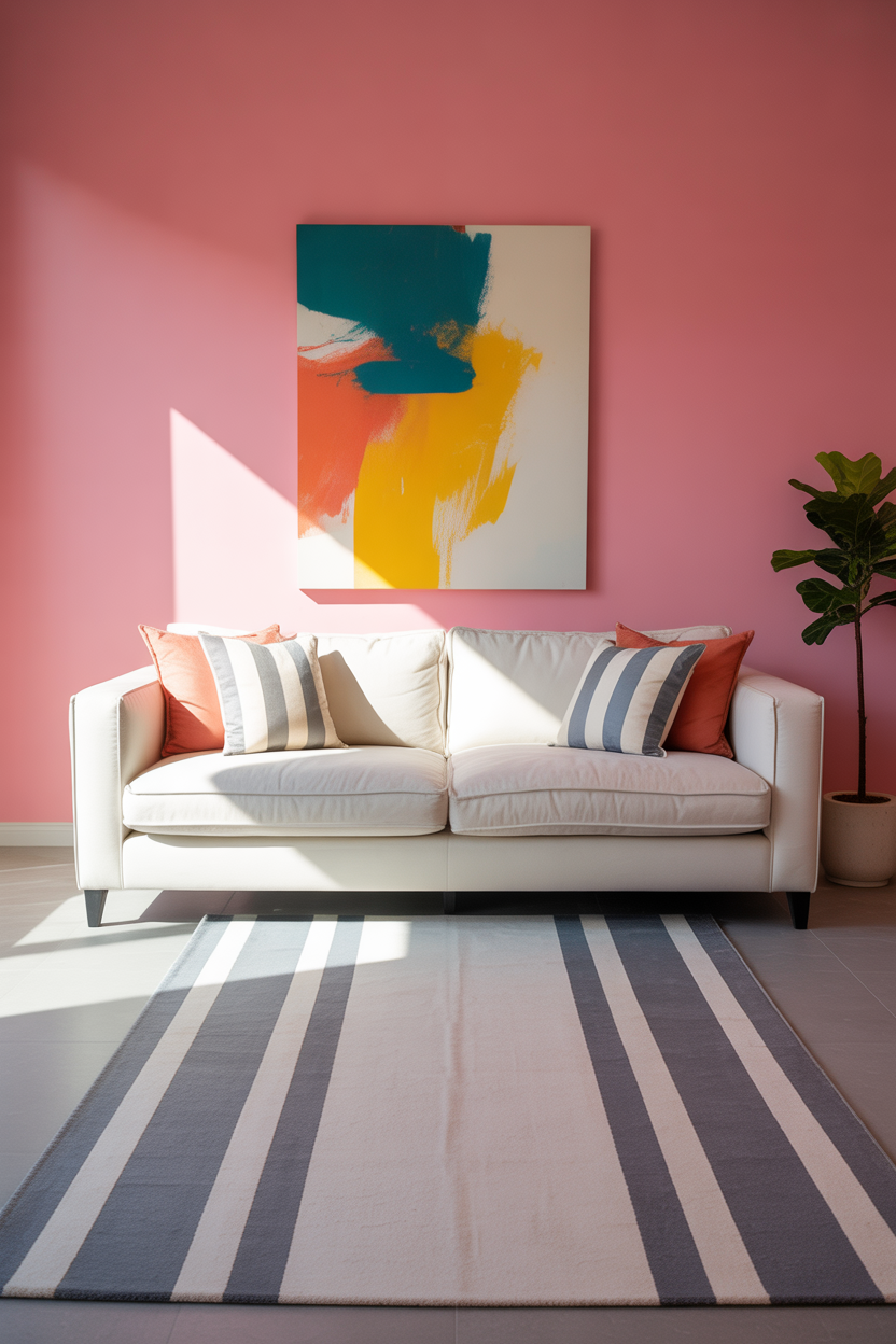
3. Coral and Peach Tones
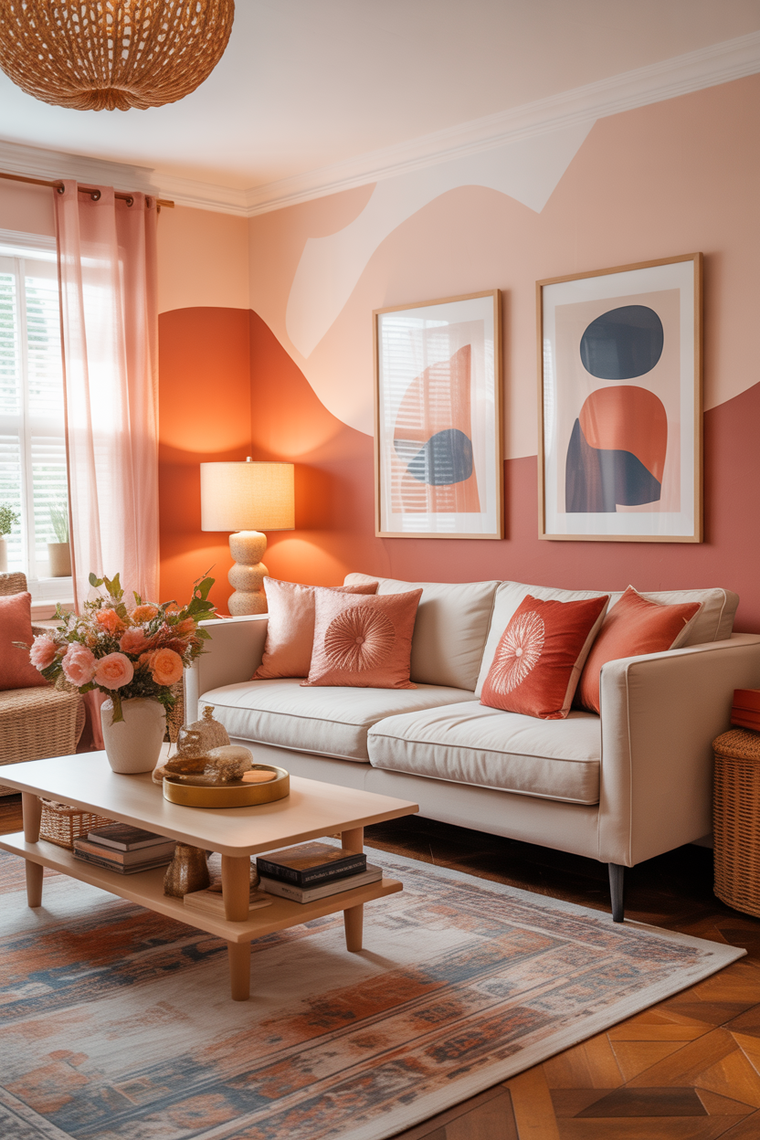
Coral and peach bring a playful, summery energy that’s both cozy and bold. These warm hues add a touch of femininity and creativity to your living space without being overly loud.
They pair well with cream, terracotta, or even navy blue accents for contrast. Add velvet pillows or abstract art to round out the look in a stylish way.
Best For: Boho or eclectic living rooms that celebrate color and creativity.
Pro Tip: Choose deeper coral for accent walls and lighter peach for furniture or rugs to create layers of color.
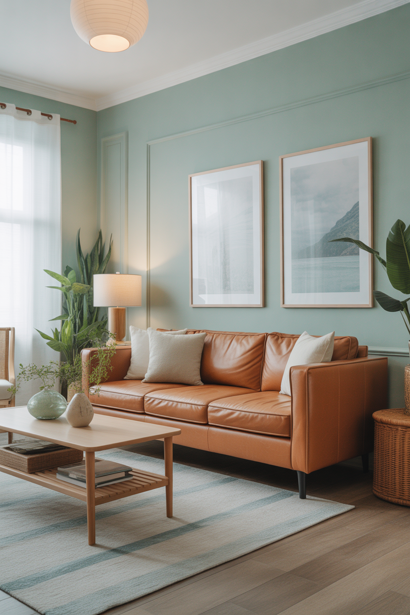
4. Aqua and Mint Green Blend
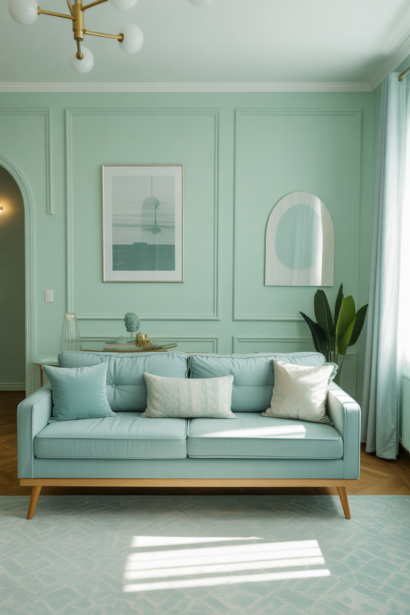
Aqua and mint are refreshing and joyful without being overpowering. These cool tones help bounce light around the room while offering a subtle, spa-like serenity.
Use them on walls, curtains, or accent chairs, and layer in gold or brass hardware for a bit of grown-up glam. The balance of playful and polished is what makes this combo so charming.
Best For: Light-filled spaces that lean toward soft minimalism or mid-century chic.
Pro Tip: Choose muted pastel variations to keep the room feeling peaceful, not neon.
5. Tangerine Orange Pop
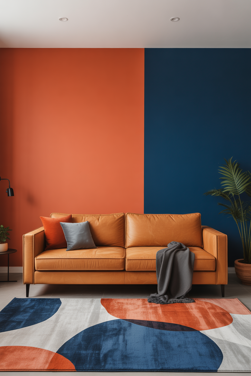
Tangerine is bold, vibrant, and full of personality. As an accent color—on a feature wall, rug, or even a velvet sofa—it instantly livens up a room and adds a punch of happiness.
It works surprisingly well with cool-toned grays, navy blues, and creamy whites, creating a playful contrast that feels modern and energetic.
Best For: Contemporary or artistic homes that want a joyful, eye-catching vibe.
Pro Tip: Use orange in geometric or abstract prints to tone it down while keeping it fun.
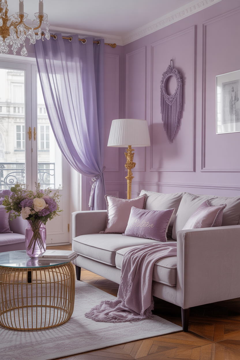
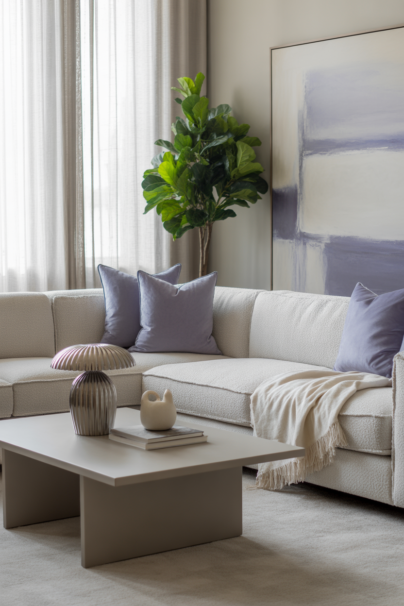
6. Lavender and Soft Lilac
Lavender and lilac create a dreamy, uplifting effect in any living room. These soft purples bring a touch of elegance while evoking feelings of peace and whimsy. They’re ideal if you want a space that feels both calm and cheerful.
Pair with light neutrals like beige or dove gray for balance. Add gold accents, floral cushions, or sheer curtains to complete the delicate, airy look.
Best For: Feminine, romantic, or Parisian-inspired living rooms with a soft palette.
Pro Tip: Stick to pale lilac on larger surfaces and use lavender for smaller accents to avoid visual overload.
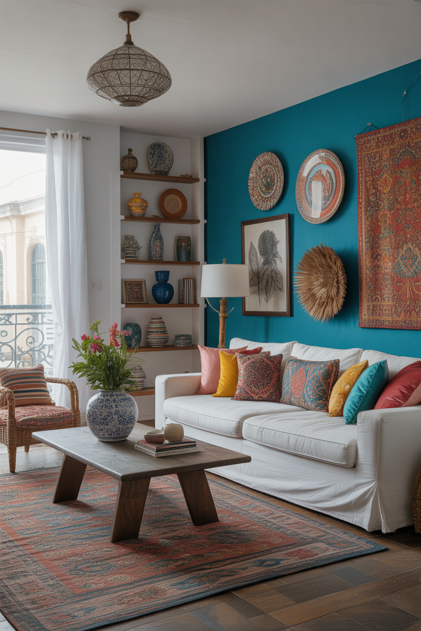
7. Bright Turquoise Splash
Turquoise is refreshing, vibrant, and full of playful energy. It can make your space feel creative and free-spirited, especially when paired with crisp whites or bold patterns.
Use it as an accent wall, on a velvet armchair, or through decor like ceramics and artwork. It’s a great way to infuse a space with personality without taking over the entire palette.
Best For: Artistic or globally inspired interiors with eclectic charm.
Pro Tip: Break up the intensity with wood tones or neutral rugs to keep the look grounded.
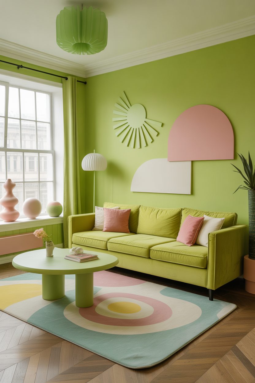
8. Zesty Lime Green
Lime green is unexpected and exciting—it injects an energizing jolt of color into your living room. Use it to create a fun and youthful atmosphere that feels fresh and inviting.
Tone it down with plenty of white or mix it with pastel pinks and soft yellows for a quirky, happy vibe. Even small touches, like throw pillows or lamps, can make a big statement.
Best For: Modern or retro-style spaces that embrace bold color choices.
Pro Tip: Use lime green near natural light sources where it will really glow and reflect cheer.
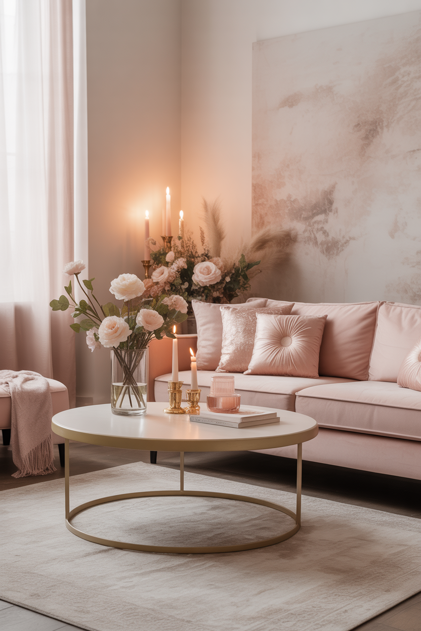
9. Blush Pink and Cream
Blush pink is one of the most versatile happy hues. Soft, warm, and understated, it blends beautifully with cream tones to create a cozy and elegant space without overwhelming the senses.
This color combo brings in just the right amount of color for those who want a fresh look that still feels neutral and mature. Add velvet textures, candles, or floral arrangements to elevate the softness.
Best For: Soft glam or Scandinavian-inspired homes that crave coziness with color.
Pro Tip: Use matte blush paint or fabric to avoid a glossy or overly girly finish.
10. Lemon Sorbet and White
Lemon sorbet is a soft yellow shade that brings sunshine indoors without being too loud. It creates a gentle, cheerful vibe that feels lighthearted and timeless.
When paired with clean whites and light woods, it instantly brightens the room and makes it feel more open. This combo works beautifully in both traditional and modern spaces.
Best For: Compact living rooms that need a touch of radiance and positive energy.
Pro Tip: Use lemon sorbet on accent walls or drapes, and anchor the look with neutral furniture.
11. Soft Pistachio Green
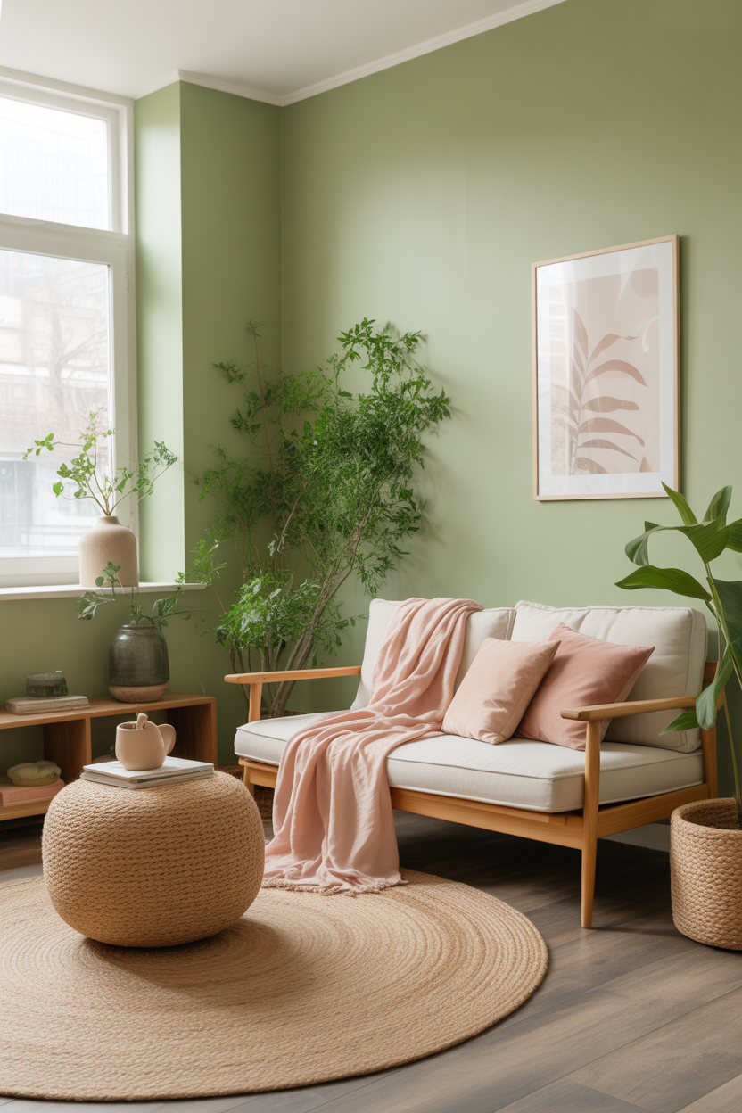
Pistachio green has a gentle, calming tone with an unexpected freshness. It brings a touch of nature indoors and feels serene while still adding brightness to your living room.
This pastel shade works well with light woods, white trim, or blush pink accessories. It’s ideal for creating a peaceful but cheerful retreat you’ll want to spend time in every day.
Best For: Nature-inspired living rooms or wellness-focused spaces that emphasize calm and clarity.
Pro Tip: Pair pistachio walls with textured natural elements like jute rugs or linen curtains for a grounded feel.
12. Powder Blue and Sand
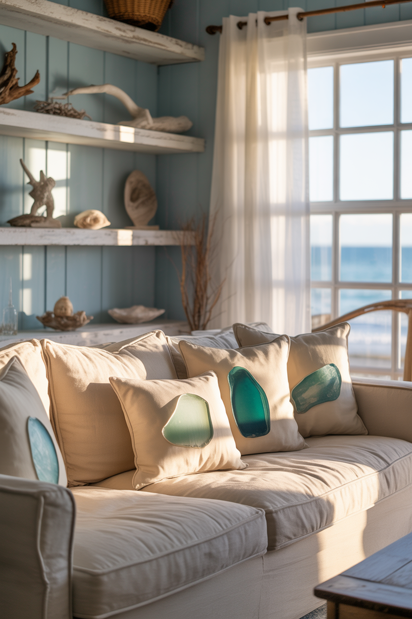
Powder blue evokes openness and clarity, while sandy beige brings warmth and comfort. Together, they create a coastal vibe that’s easygoing and full of light.
Use this pairing across walls, rugs, and cushions for a harmonious look. Add accents of whitewashed wood or sea glass to make the room feel like a breezy getaway.
Best For: Coastal or beach-style homes where relaxation and joy are key themes.
Pro Tip: Try a half-wall color split—powder blue on the bottom, sand above—for visual interest and balance.
13. Watermelon and White Combo
Watermelon pink is bold, juicy, and bursting with fun energy. When paired with white, it creates a playful yet clean contrast that makes any space feel more youthful and dynamic.
Use it in patterns—like stripes or abstract art—or commit to a feature wall paired with white sofas or rugs. This combo is surprisingly chic when done with intention and restraint.
Best For: Modern, vibrant living rooms or family spaces with personality.
Pro Tip: Break up bold watermelon tones with white geometric decor to keep the look sharp and modern.
14. Tangerine and Teal Fusion
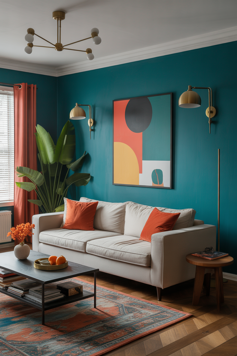
The warmth of tangerine and the cool depth of teal create a color pairing that’s bold, joyful, and full of energy. These complementary colors play off each other beautifully and bring a sense of drama and creativity to your space.
Use teal as a grounding tone for sofas or walls, then layer in tangerine accents through pillows, art, or lighting. The result is a lively, design-forward space that feels upbeat and unique.
Best For: Creative homes and open-plan layouts that need lively color interaction.
Pro Tip: Add metallics like brass or gold to enhance the luxury feel of this vibrant duo.
15. Spring Green and Yellow Mix
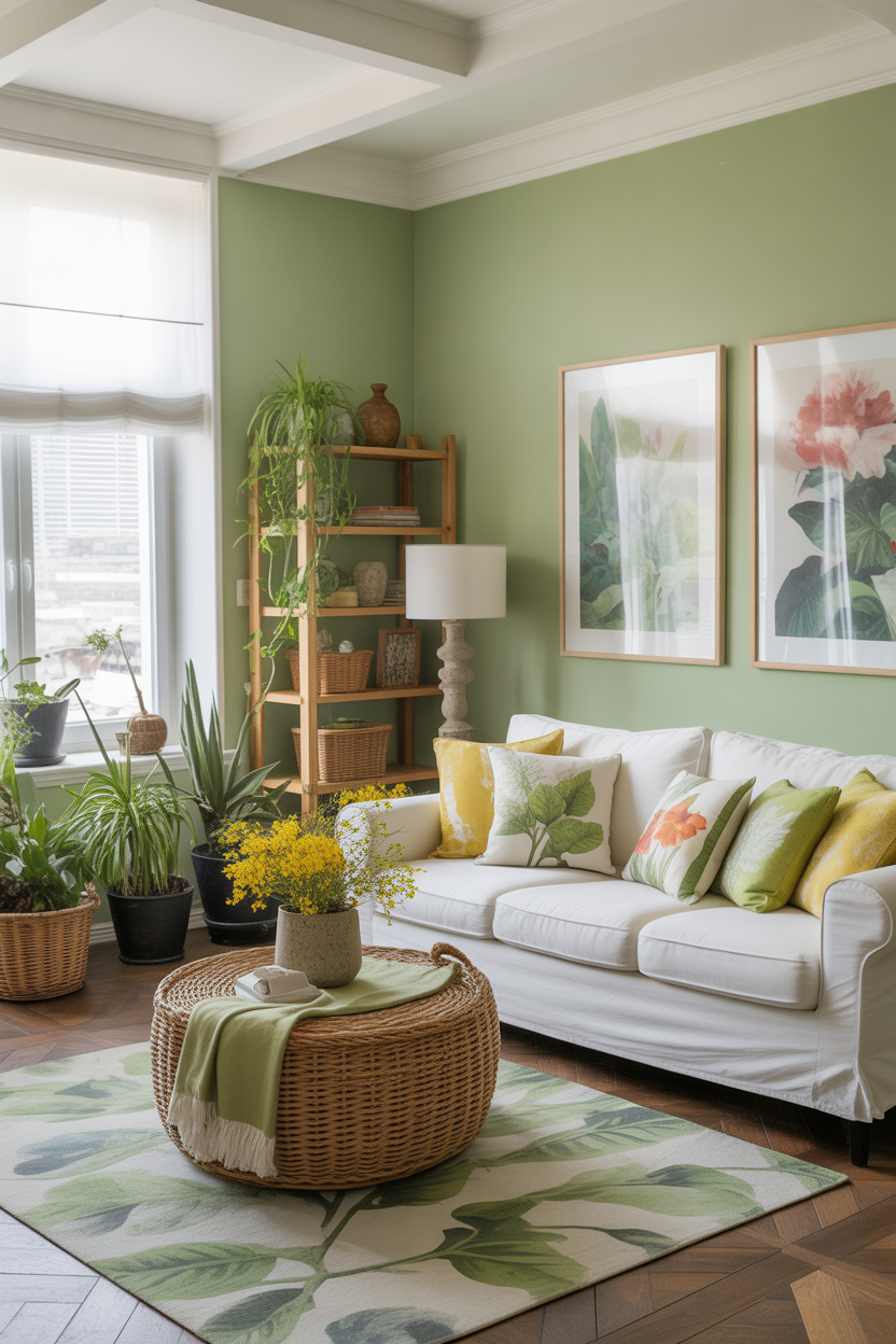
This fresh pairing of spring green and sunny yellow creates a color palette straight from a blooming garden. It feels alive, invigorating, and filled with the joy of the outdoors.
Apply it through textiles like patterned drapes or layered throw pillows. Add in crisp white furniture to allow the colors to pop while keeping the space feeling light and modern.
Best For: Botanical-themed living rooms or homes that blend indoor and outdoor living.
Pro Tip: Use greenery—like potted plants or hanging vines—to reinforce the connection to nature and complement the palette.
16. Rose Pink and Olive Green
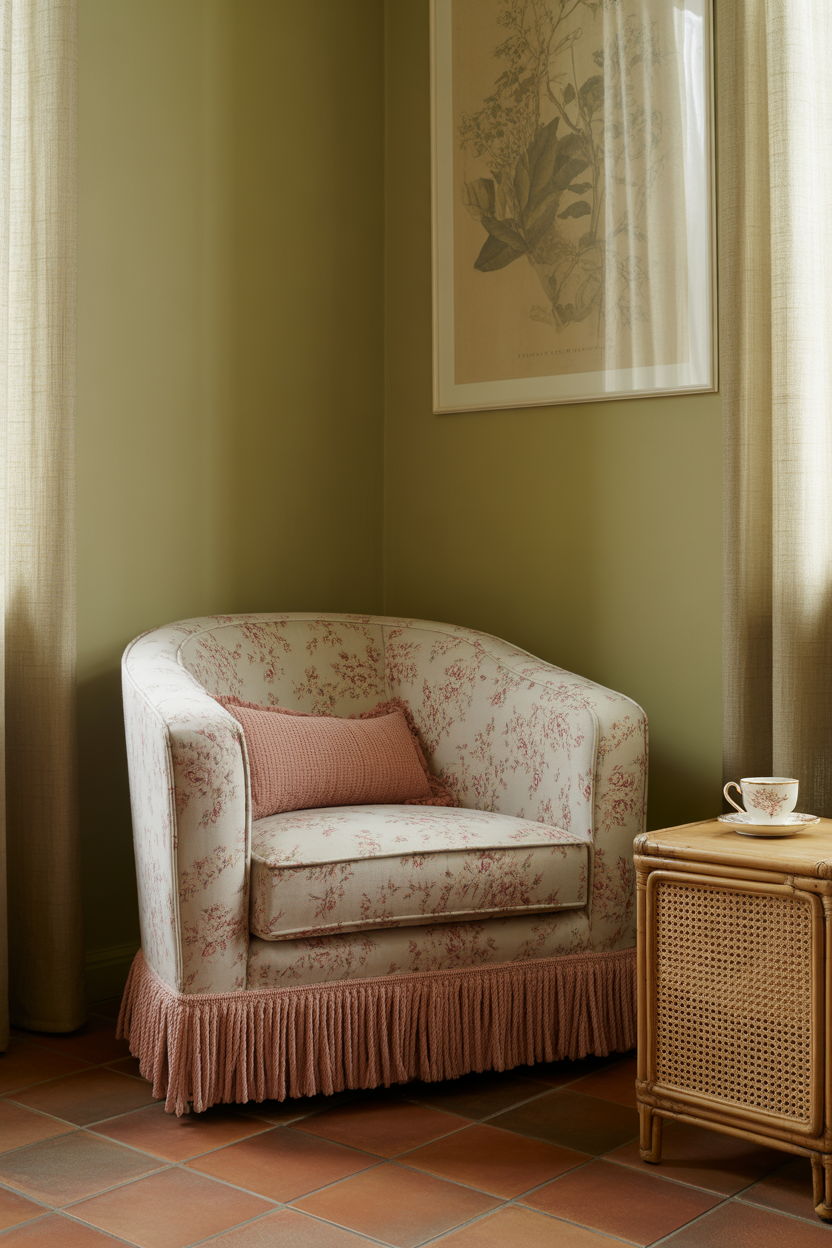
Rose pink and olive green may seem like opposites, but together they strike a beautiful balance between warmth and depth. The rose adds romance and brightness, while olive offers an earthy anchor that feels timeless.
This palette is perfect for creating a cozy yet elevated living space. Think pink upholstery against olive-toned walls, or floral cushions paired with leafy green plants.
Best For: Sophisticated interiors with a soft, feminine touch and grounded elegance.
Pro Tip: Use natural materials like cane, linen, or terracotta to bridge the gap between both colors for harmony.
17. Light Teal and Crisp White
Light teal feels like ocean mist—refreshing, peaceful, and perfect for creating a sense of calm clarity. When paired with bright white, it adds a breath of fresh air to your living room.
Use teal for walls, armchairs, or even ceiling accents, and let white keep everything feeling spacious and clean. The combination feels cool but welcoming.
Best For: Contemporary, coastal, or wellness-inspired living rooms with lots of light.
Pro Tip: Balance the cool tones with warm wood furniture or tan leather for cozy contrast.
18. Bold Fuchsia Accents
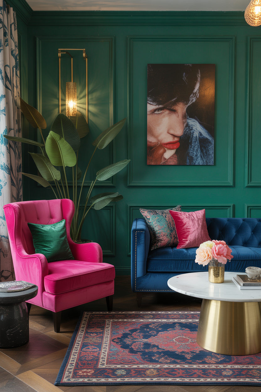
Fuchsia may seem like a daring choice, but when used strategically, it injects a room with joy and sophistication. A bold fuchsia armchair, statement rug, or large artwork can electrify a space in the best way.
This color pairs surprisingly well with navy, charcoal, and even emerald green. It’s all about the contrast—creating a space that feels fearless yet curated.
Best For: Maximalist or glam-inspired interiors that don’t shy away from color.
Pro Tip: Use fuchsia in velvet or high-gloss finishes to amplify its luxe effect without going overboard.
19. Pale Apricot and Ivory
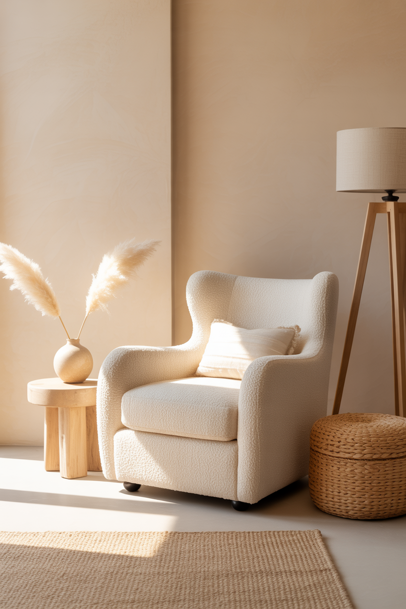
Pale apricot offers just enough color to warm up your living room without overpowering it. Combined with ivory or off-white, it creates a serene and sun-kissed effect that’s perfect for unwinding.
It’s a great option if you love light, creamy interiors but want a little more personality than beige. Add texture with boucle furniture, baskets, or woven decor.
Best For: Minimalist or modern boho homes that embrace softness and simplicity.
Pro Tip: Use warm white lighting to bring out the apricot glow in the evenings.
20. Bright Periwinkle and Light Gray
Periwinkle is a happy medium between blue and purple, with a playful energy that feels airy and modern. When paired with light gray, it becomes both vibrant and grounded—perfect for cheerful sophistication.
Use periwinkle on throw pillows, rugs, or accent walls, and let the light gray provide a calm base throughout the space. This duo feels fresh without being loud.
Best For: Creative and transitional living rooms that balance color and calm.
Pro Tip: Add a pop of metallic—like silver or brushed nickel—to give the palette a polished finish.
Final Thoughts
A bright living room doesn’t just look good—it can lift your spirits, energize your home, and reflect your personality. Whether you go for bold citrus tones, soft pastels, or unexpected color pairings, the key is to design a space that feels as happy as it looks.
Try out one of these bright living room color ideas to create a space that radiates joy every single day. And don’t forget—your home should feel like you.
🌈 Follow @TrendyDecorGuide for more colorful, uplifting design ideas that turn everyday spaces into feel-good retreats.