25 Colorful Living Room Ideas to Brighten Up Your Space
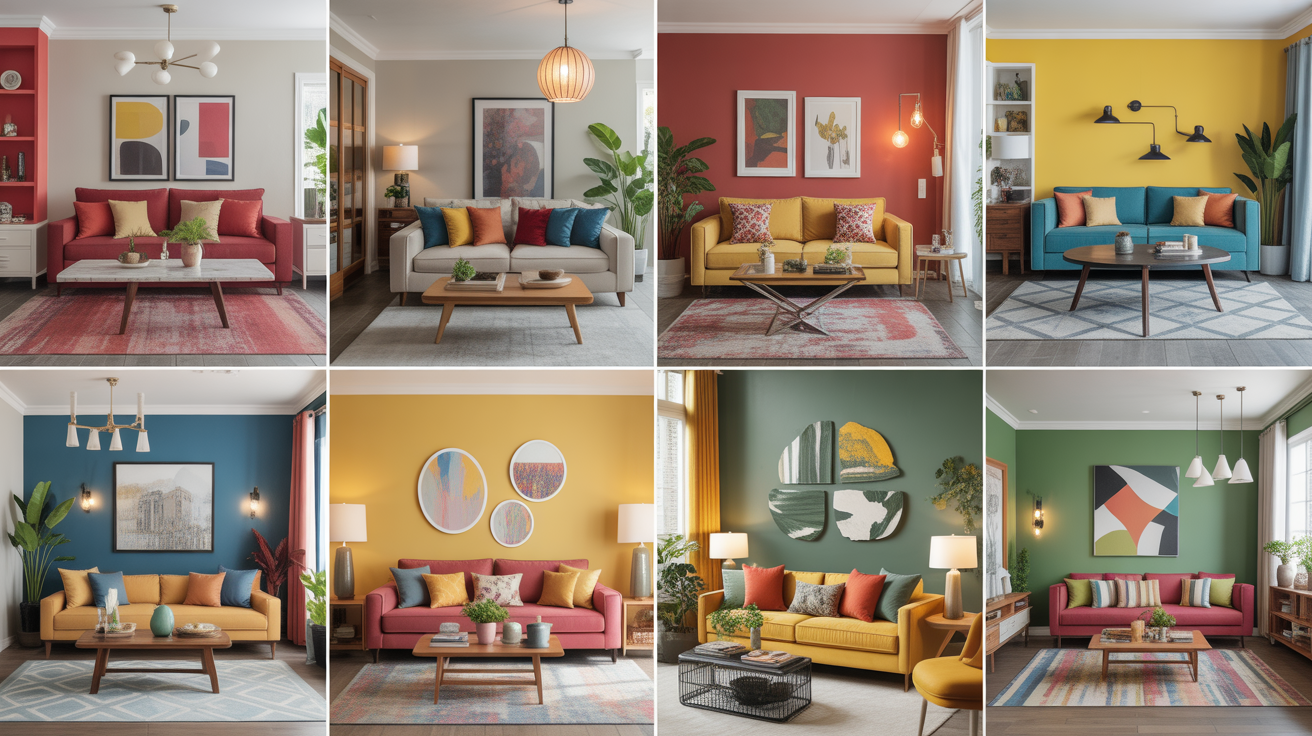
A colorful living room isn’t just about bold walls or quirky throw pillows — it’s a reflection of your energy, creativity, and personal style. Whether you’re drawn to tropical bright, earthy warmth, or moody jewel tones, the living room is your canvas for color. And the best part? Even a small splash of color can completely shift the mood of the space.
In this guide, we’re sharing 25 colorful living room ideas that range from daring to subtle, all designed to infuse life and joy into your home. Whether you’re ready to go all in with bold paint or just looking to update your throw pillows and rugs, you’ll find inspiration for every kind of vibe — maximalist, modern, eclectic, or cozy. Let’s dive into color that speaks your language.
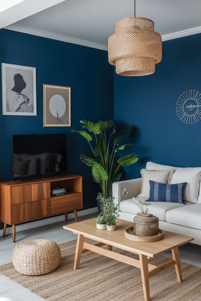
1. Color-Drenched Accent Wall
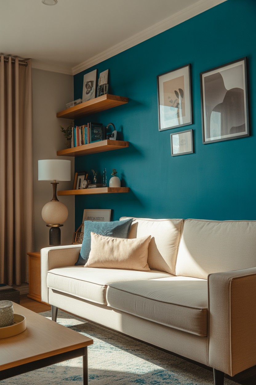
A bold accent wall is one of the easiest and most effective ways to inject personality into your living room. Think deep teal, cherry red, or mustard yellow — whatever energizes you. One striking wall draws the eye and anchors the entire room without overwhelming the space.
Pair your colorful wall with neutral furniture or layer in patterned textiles to add depth. A color-drenched backdrop creates a gallery-like effect, perfect for showcasing art or floating shelves filled with personality-packed decor.
Best For: Anyone craving high impact with low commitment.
Pro Tip: Use peel-and-stick wallpaper or matte-finish paint for a quick, renter-friendly option.
2. Yellow Sofa with Earthy Accents
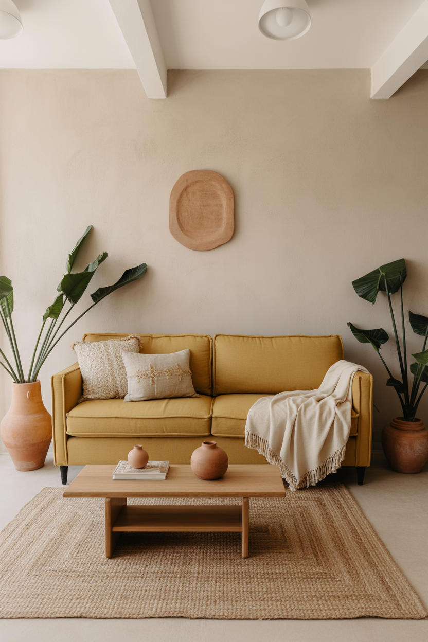
A yellow sofa might sound daring, but it’s surprisingly versatile. Choose a mustard or ochre shade for a warm, grounded feel. It pairs beautifully with earthy accessories like terracotta pots, jute rugs, and wooden coffee tables.
To keep the room feeling cohesive, layer in warm neutrals and textures — think cream throws, beige curtains, and clay-colored pillows. The result is a sun-kissed space that feels relaxed and joyful.
Best For: Free spirits who love sunshine in design form.
Pro Tip: Go for a slipcovered option in cotton or linen — it’s easier to clean and perfect for softening a bold hue.
3. Botanical Green Everywhere
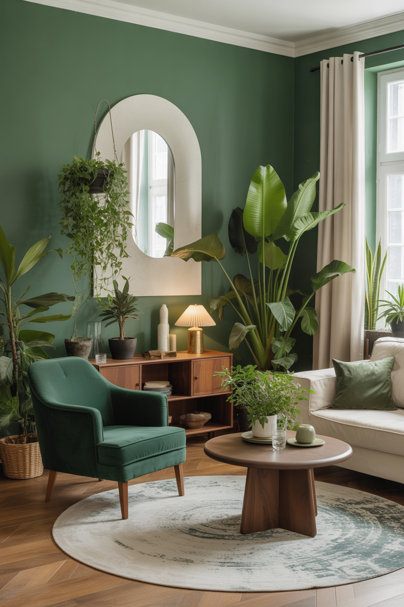
Channel the lushness of nature with a living room full of green tones. Go all in with sage green walls, emerald velvet seating, or a forest-toned area rug. This color family brings peace, balance, and freshness into any space.
Balance it out with warm wood accents, cream upholstery, and woven textures like cane or rattan. For an extra organic touch, layer in plenty of real or faux plants to make the room feel like an indoor oasis.
Best For: Nature lovers, plant parents, and calm-seekers.
Pro Tip: Mix 3–4 shades of green in the same room to keep the palette dimensional and vibrant without clashing.
4. Red, Rust, and Terracotta Layers
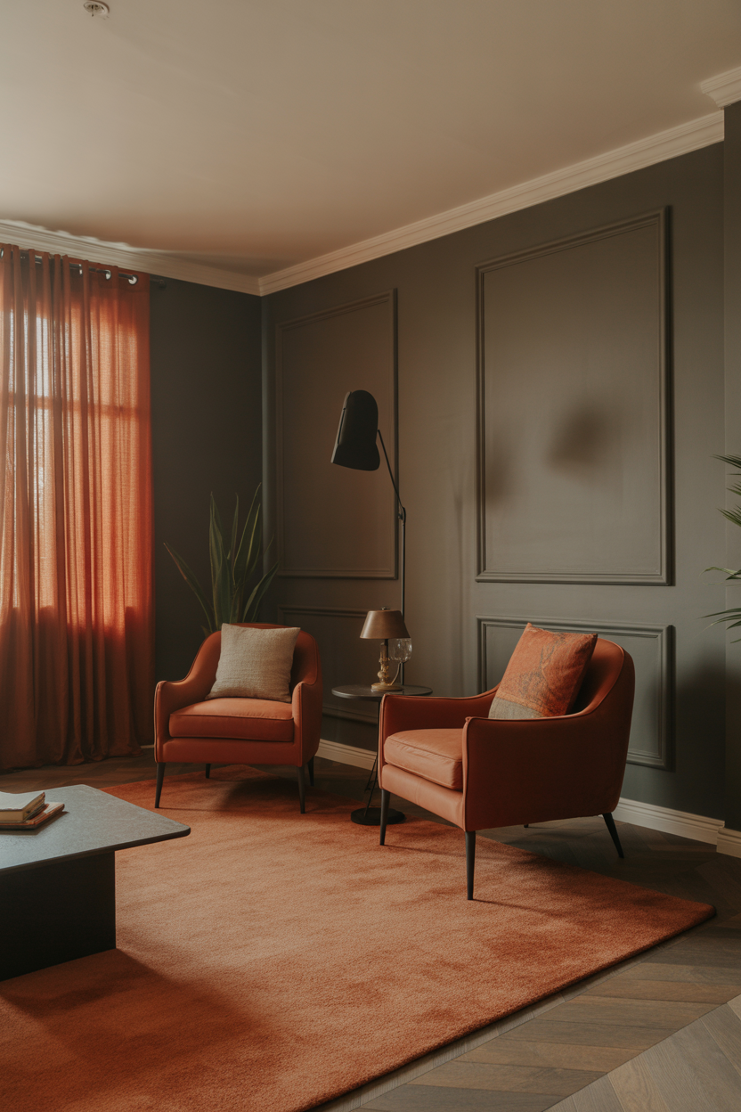
Red isn’t just for dining rooms — a spicy, grounded red can totally transform your living area. Go for rust velvet chairs, a terracotta area rug, or paprika-colored curtains to add heat and drama.
Balance the warmth with cool blue-gray walls or off-white furniture. Layer in natural materials like linen, leather, or rustic wood to keep the look earthy and inviting, not overpowering.
Best For: Warm minimalists or anyone who wants cozy with edge.
Pro Tip: Don’t mix too many types of red — pick one undertone (like orange or brown-based) and build around it for harmony.
5. Purple Pop with Modern Neutrals
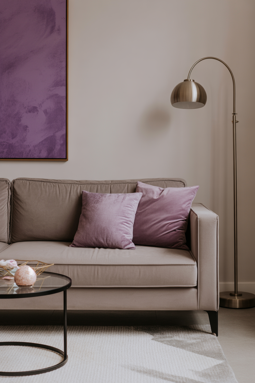
Purple in the living room? Absolutely — especially when paired with modern neutral tones. Think lilac cushions on a taupe sofa, or a violet abstract print hung against a white wall. This combo feels fresh, unexpected, and elevated.
Add light gray, soft beige, or warm white furniture to keep the room from feeling too theatrical. Metallic accents like brass or gold give purple hues a luxe, designer edge.
Best For: Design-forward creatives who love a color with flair.
Pro Tip: Try pairing lavender or mauve with blush and camel for a soft, tonal, and very Pinterest-friendly look.
6. Tangerine Throw Pillows + Warm Wood
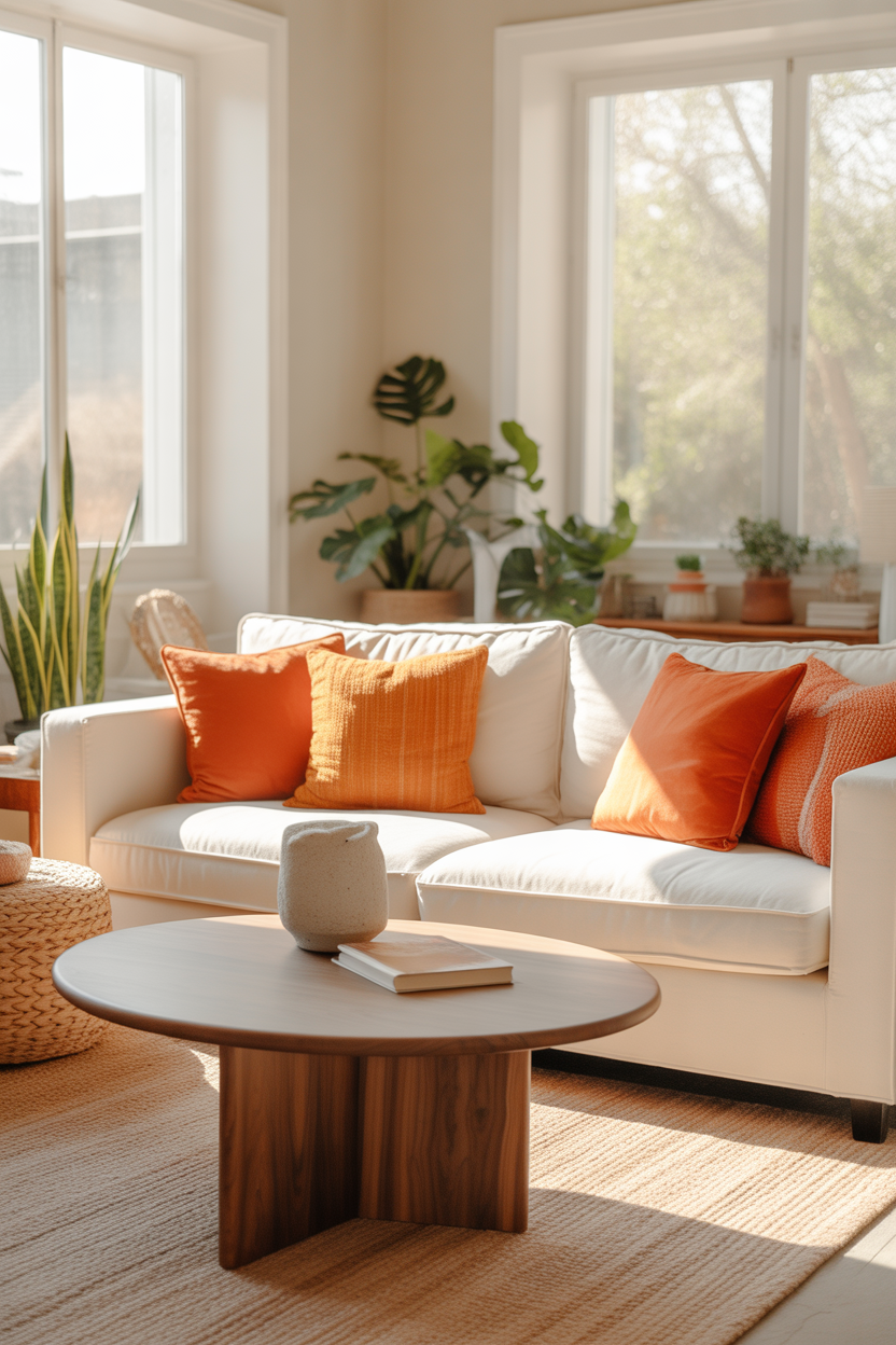
Tangerine might be one of the most underrated statement colors for a living room. It adds instant cheer and playfulness without going overboard. Start small with throw pillows or a printed throw blanket for an energizing pop of citrus.
When paired with warm woods — like walnut coffee tables or oak shelving — tangerine feels modern but grounded. The wood tones mellow the brightness and keep the color from overpowering the room.
Best For: Playful, modern homes that lean cozy.
Pro Tip: Use high-contrast tangerine in a room with lots of natural light to make it glow rather than shout.
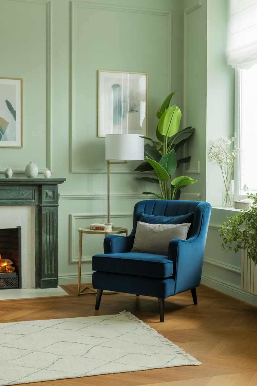
7. Blue Sofa, Bold Personality
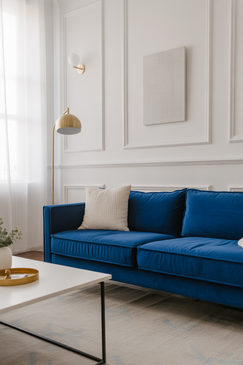
A blue sofa is a classic move — but if you go bold with royal or cobalt blue, it becomes a statement. It’s striking without being loud, and pairs beautifully with neutrals, metallics, or even complementary hues like orange or coral.
To let the sofa shine, keep other elements understated. White walls, minimalist decor, and a few textured accents will make the color pop while still feeling cohesive and relaxed.
Best For: Trendsetters who want one strong statement piece.
Pro Tip: Use a rug with subtle blue flecks or border trim to anchor the sofa and visually tie the room together.
8. Lime Green with Monochrome Contrast
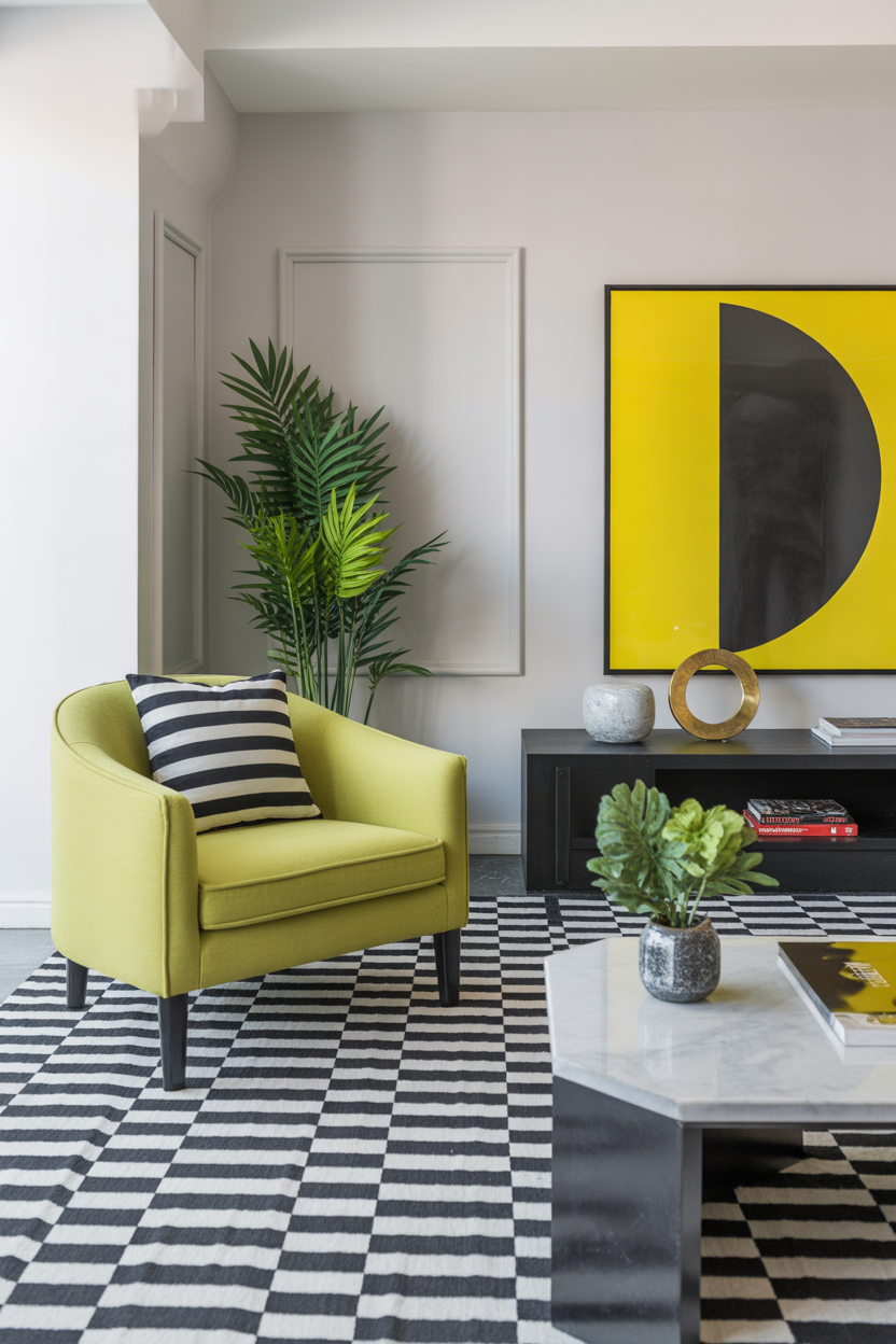
Lime green brings instant freshness and youthfulness to a space. If your living room feels flat, try lime green pillows, an accent chair, or a painted alcove. It’s bold, but when used with restraint, it’s totally doable.
Black-and-white decor creates the perfect contrast — especially in geometric rugs, marble-top tables, or modern artwork. Lime becomes the pop of color that energizes the entire space.
Best For: Urban interiors or eclectic designs that love high contrast.
Pro Tip: Use lime in small, intentional doses to avoid sensory overload — one or two accents is plenty.
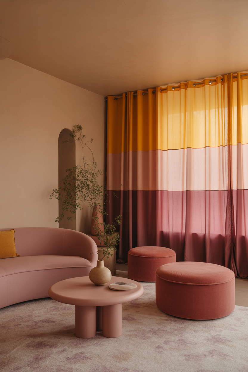
9. Color-Blocked Walls for a Modern Touch
Color-blocking isn’t just for fashion. In the living room, it gives major design cred with minimal cost. Try painting a lower third of the wall navy and leaving the top white. Or go soft with blush and cream combos for a subtle look.
You can also experiment with wall decals or removable paint strips to test out a color-block layout before committing. It’s playful, fresh, and adds depth to any space — especially when paired with streamlined furniture.
Best For: Design lovers who want something unique but not overwhelming.
Pro Tip: Keep furniture and decor simple so the color-blocking remains the focal point without visual clutter.
10. Rainbow Bookshelf Display
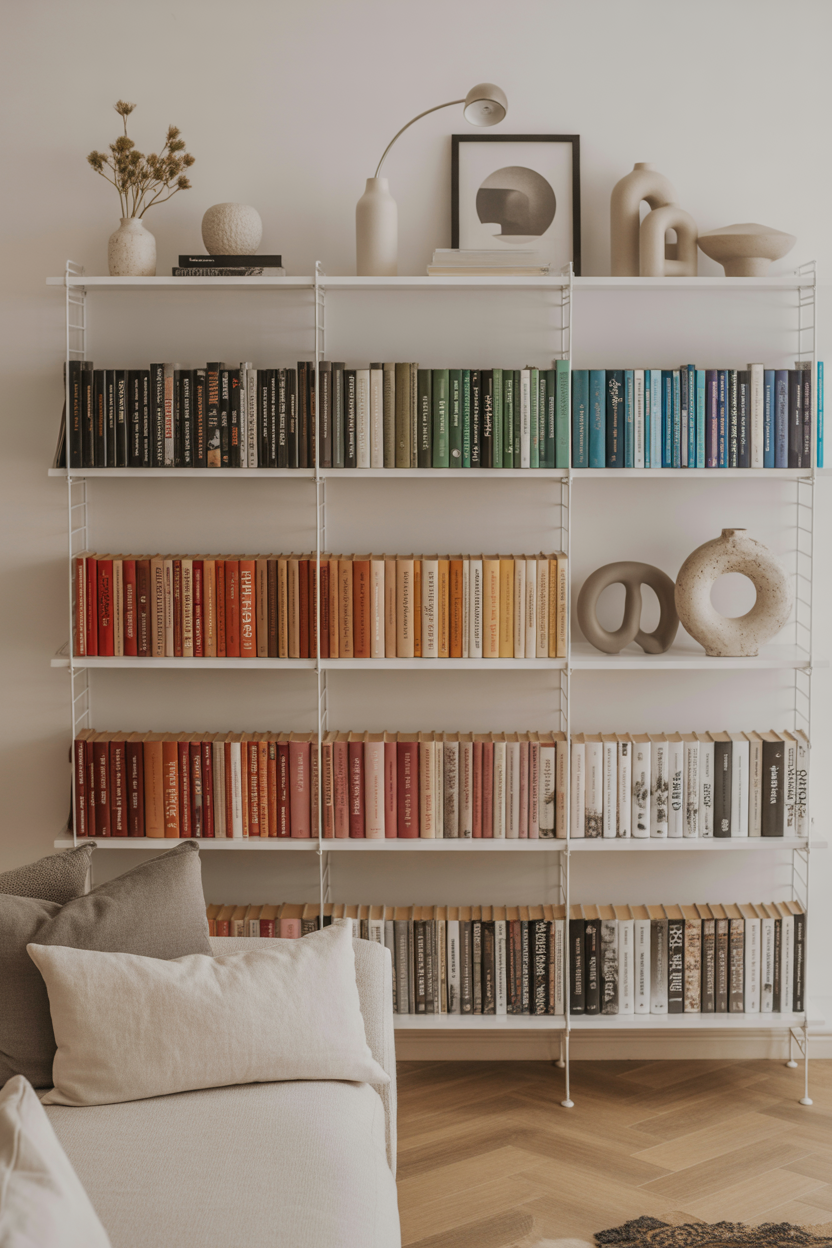
If you’ve got a ton of books, why not let them be your decor? Arrange them by color to create a built-in rainbow that feels intentional and vibrant. It works great on open shelves, built-ins, or even a tall vertical bookcase.
Pair your rainbow display with a neutral wall color and simple shelf styling — think vases, ceramics, or artwork in between color groups. It adds an instant mood boost and makes your collection feel like art.
Best For: Avid readers and collectors who love joyful design.
Pro Tip: Don’t overfill the shelf — leave negative space for each section so the rainbow effect feels airy and clean.
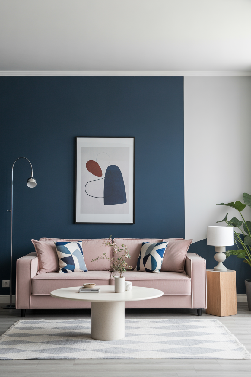
11. Blush and Coral Duo
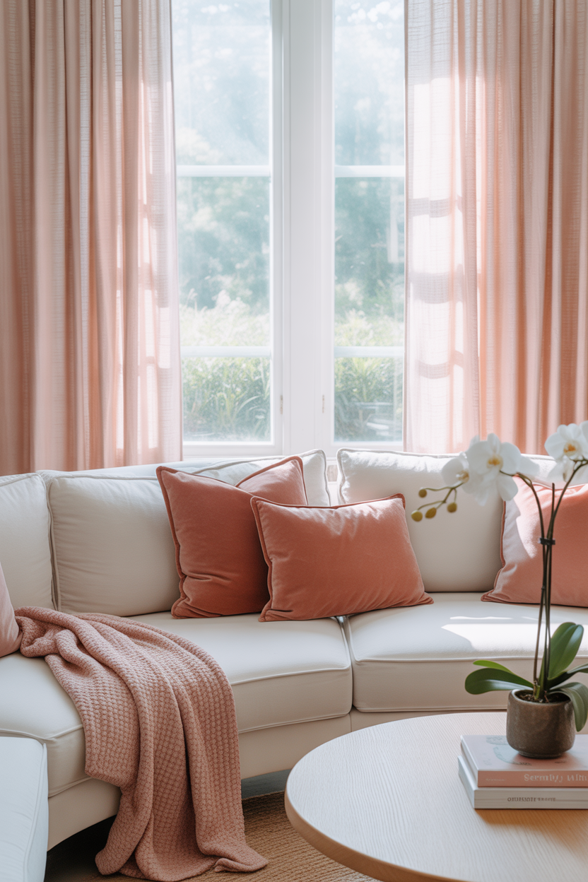
Blush pink and coral make a dreamy, modern combo that instantly softens a living space. Use a blush-toned sofa or curtains, then add coral accents through throw pillows, art, or a rug. The tones are warm, layered, and feminine without feeling too delicate.
Balance this palette with crisp white walls or light oak furniture to keep it fresh and breathable. It’s especially great in small or low-light rooms where dark colors might feel heavy.
Best For: Soft, contemporary spaces with a relaxed vibe.
Pro Tip: Mix textures like velvet, boucle, or linen to give the pastel palette depth and sophistication.
12. Bold Blue Walls + Natural Texture
A full blue room might sound bold, but in the right tone, it’s a total game-changer. Rich shades like navy or denim bring coziness, while brighter hues like periwinkle or sky blue feel fresh and bright.
Layer in natural materials like jute rugs, wood furniture, or rattan lighting to keep the space from feeling too cold. The balance of color and texture creates a curated, magazine-worthy feel that’s still comfortable and livable.
Best For: Coastal lovers, color-maximalists, or anyone craving bold comfort.
Pro Tip: If you’re painting all four walls, opt for a flat or matte finish to reduce glare and make the space feel grounded.
13. Eclectic Patterns in Bold Tones
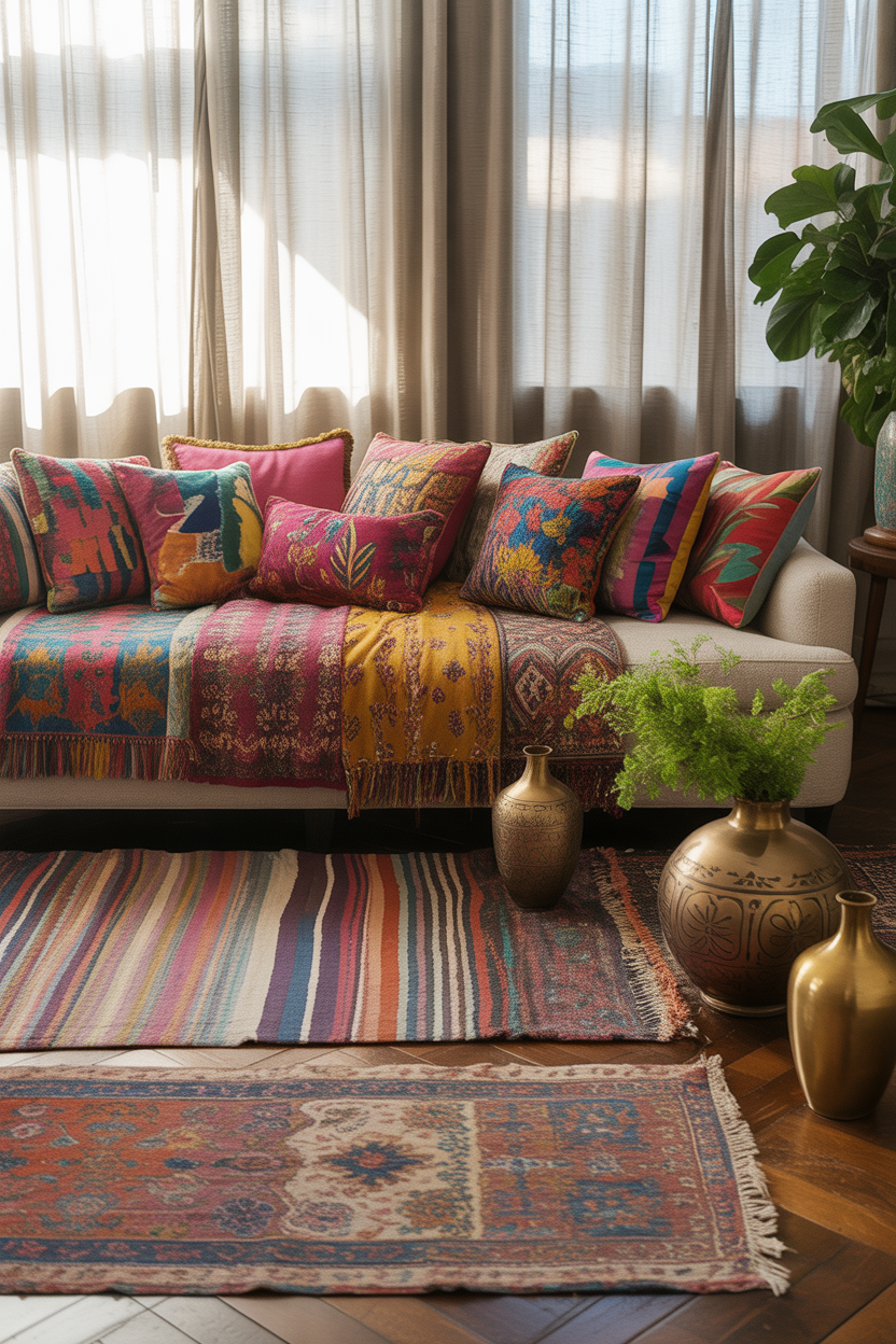
Mixing patterns in a range of saturated colors can make your living room feel like an art project in the best way. Combine stripes, florals, geometrics, and tribal prints in cohesive tones — like jewel-toned blues, emeralds, and purples.
Ground the room with a solid-color sofa or neutral floor to avoid visual overload. Use consistent shapes or repeated patterns to tie it all together and give the eye a place to rest.
Best For: Creative souls and maximalists who love curated chaos.
Pro Tip: Stick to a 3-color base palette to help even the busiest mix of prints feel harmonious and balanced.
14. Sunshine Yellow Walls
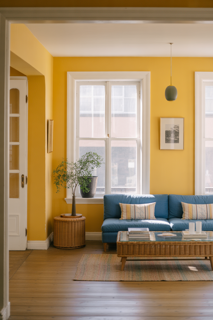
Painting the entire living room a buttery yellow is a bold move — and a rewarding one. This sunny shade can uplift your mood, make the space glow in natural light, and add a ton of character. Pair it with simple white trim for contrast and clarity.
Complement it with blue, green, or wood-toned furniture to create balance. A yellow backdrop feels both vintage and modern, and with the right styling, it can work in everything from eclectic boho to retro glam.
Best For: Optimists, creatives, and anyone who wants sunshine indoors.
Pro Tip: Choose a soft, warm yellow — bright primary yellows can read harsh unless balanced with cool tones.
15. Warm Desert-Inspired Palette
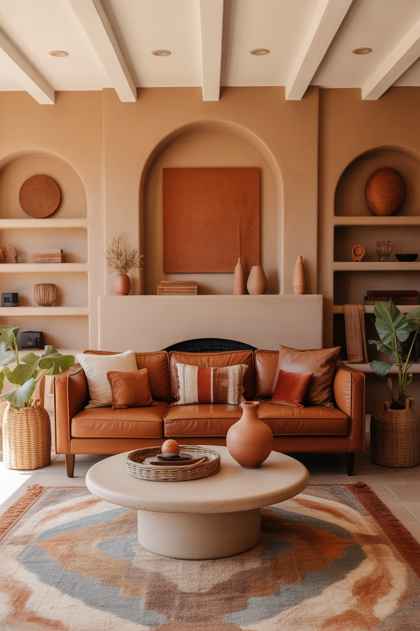
Channel the cozy vibes of the Southwest with a desert-inspired palette. Use burnt orange, sand, cinnamon, and clay tones in upholstery, rugs, or wall paint. These colors bring heat, depth, and grounding energy to the living room.
Mix in natural materials like woven baskets, ceramic vases, and leather or suede furniture. Earth tones work incredibly well with large windows, lots of plants, or rooms with brick or stone features.
Best For: Cozy-modern interiors or homes that love a rustic twist.
Pro Tip: Add a few cool-toned accents — like a blue throw or pale gray art — to help balance out the warmth visually.
16. Teal + Gold Glam Combo
Teal is rich, moody, and full of life — and when paired with gold, it becomes downright luxurious. Try a teal velvet couch or painted wall, then layer in gold-framed mirrors, brass lighting, or accent tables with metallic bases.
This combo oozes confidence and drama but still feels totally livable when balanced with creams or pale woods. It works great in both modern glam and art deco–inspired spaces.
Best For: Glam lovers who aren’t afraid of a little drama.
Pro Tip: Add round shapes — like globe lights or curved mirrors — to soften the richness of teal and gold.
17. Colorful Rug as the Focal Point
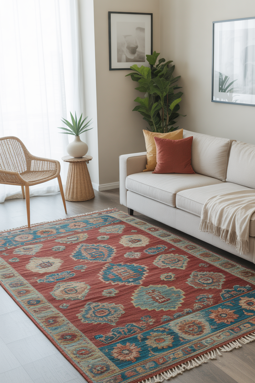
A bold, patterned rug is an easy way to bring color into a living room without painting a single wall. Whether it’s a boho medallion, a Moroccan diamond print, or a modern abstract, a colorful rug immediately grounds and energizes the space.
Build the room around the rug’s palette — pull one or two colors into pillows, throws, or artwork for a pulled-together feel. Let the rug speak loud and proud while the rest of the room plays backup.
Best For: Renters or anyone who wants instant impact with zero commitment.
Pro Tip: Use a neutral sofa and curtains to avoid competing with the rug — it deserves the spotlight.
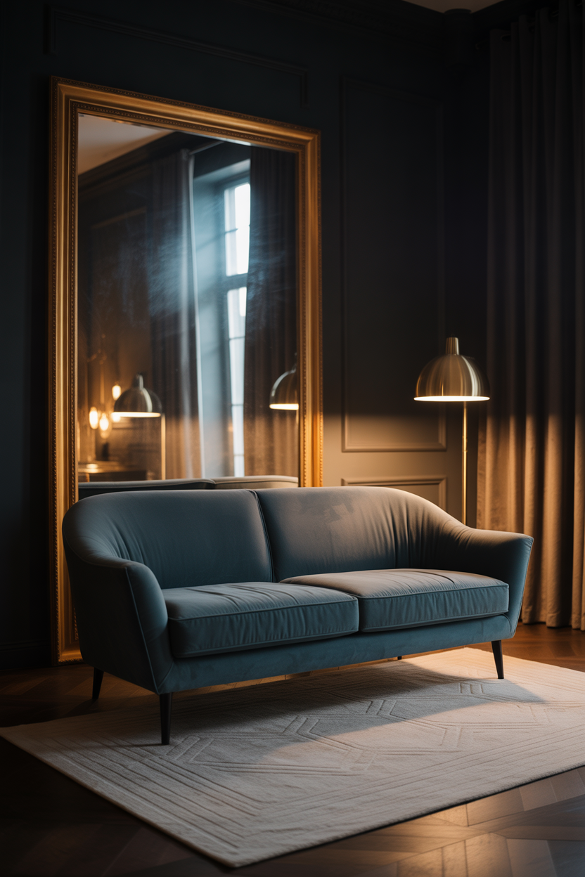
18. Moody Jewel Tones
Jewel tones like emerald, sapphire, ruby, and amethyst bring richness and drama without overwhelming a room. Use them in upholstery, drapes, or even painted ceilings for a layered, cocoon-like effect.
Mix in matte black accents or gold hardware for extra dimension. These colors work best when you let them shine against dark neutrals, giving the whole space a luxe, loungey vibe.
Best For: Bold decorators and anyone who loves evening light and intimate spaces.
Pro Tip: Use velvet or silk fabrics to really bring out the depth and shimmer of jewel-tone colors.
19. Peach + Terracotta Fusion
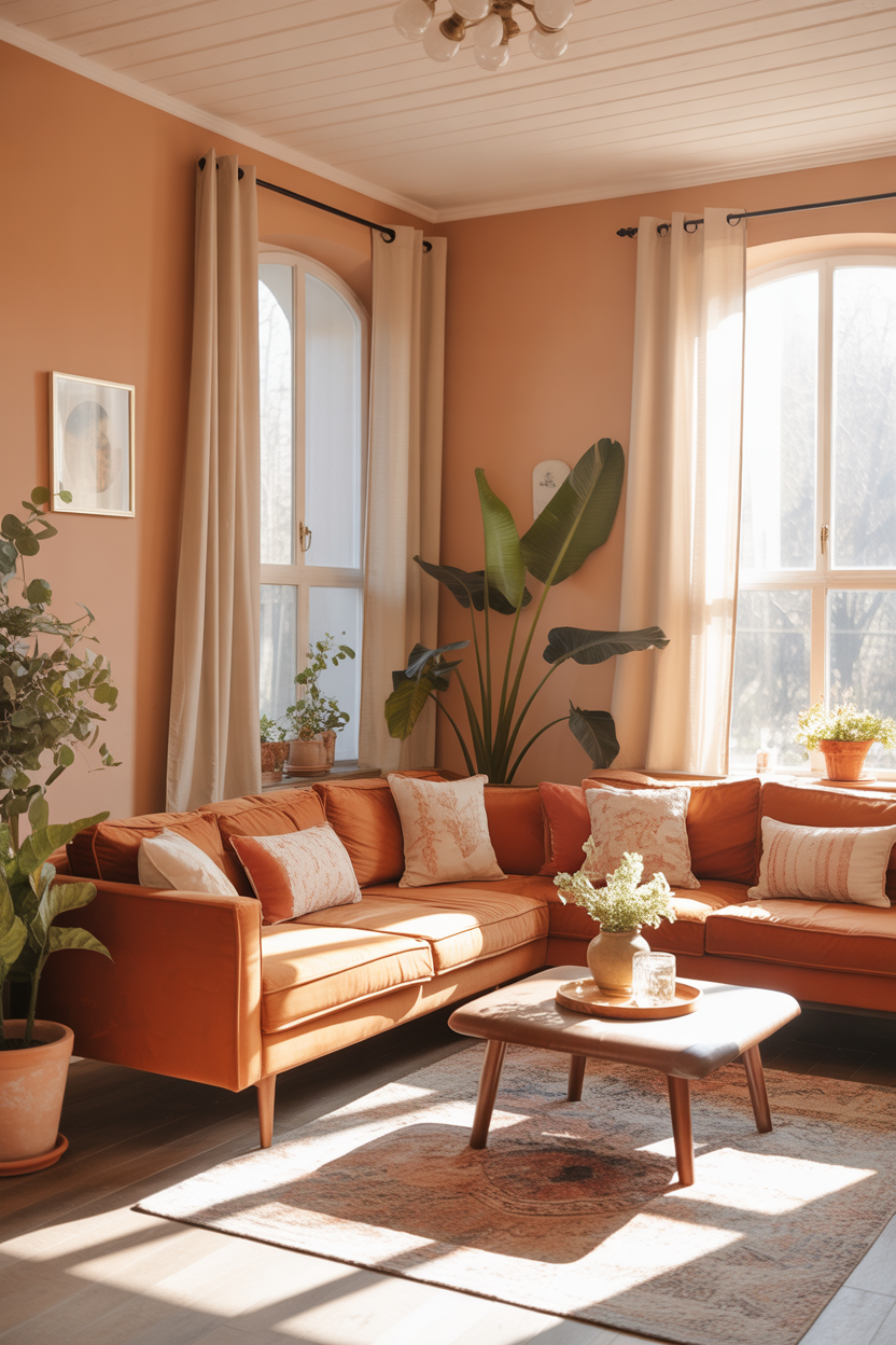
Soft peach tones mixed with deeper terracotta bring a cozy, earthy energy that’s both fresh and warm. Use peach-colored walls or curtains as a soft base, and layer in terracotta planters, clay vases, or rust-hued furniture to add contrast.
This combo is especially stunning with plenty of greenery and natural sunlight — it feels grounded but never dull. Add off-white details for balance and lightness.
Best For: Nature-lovers, cottagecore fans, or boho-inspired rooms.
Pro Tip: Add oversized green plants — the green tones bring out the richness in both peach and terracotta perfectly.
20. Statement Blue Artwork
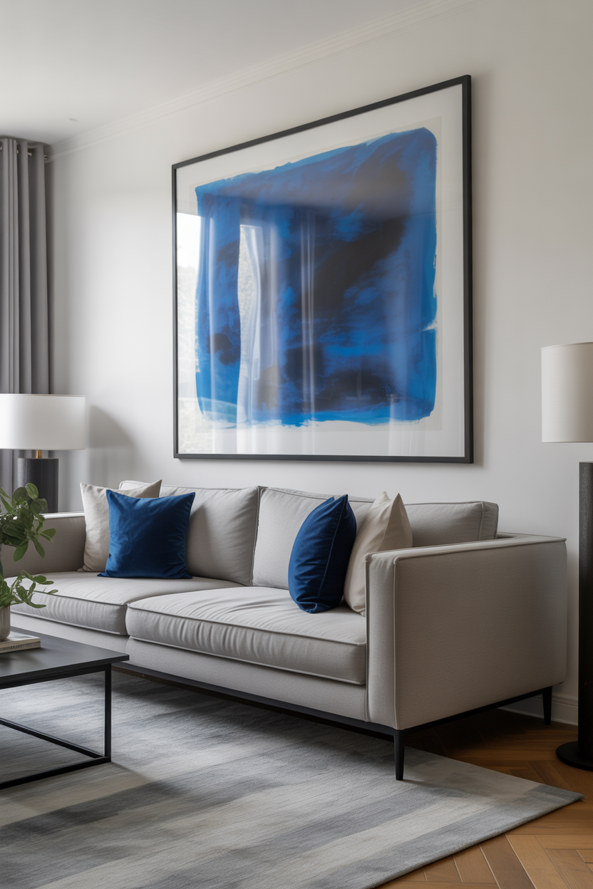
Oversized blue artwork creates an anchor point in any colorful living room. Whether it’s a cool abstract canvas, a bold geometric print, or a large framed photo, it introduces color in a way that’s bold yet refined.
Let the artwork determine your accent palette — pull shades from it into your pillows, vases, or throws. Blue art against white or gray walls brings instant contrast and makes the room feel modern and thoughtful.
Best For: Minimalists who want color without chaos.
Pro Tip: Use matching black or wood frames throughout the space for a cohesive, gallery-like effect.
21. Mint + Navy Contrast
Mint green is soft, airy, and refreshingly modern — but pair it with navy and it becomes instantly grounded. Use mint on the walls or in accessories like curtains or rugs, then anchor the look with navy seating or cabinetry.
The mint adds brightness, while the navy brings elegance and depth. It’s a perfect balance for someone who loves both cool tones and bold contrast without going full neon.
Best For: Contemporary spaces with a fresh twist.
Pro Tip: Add brass or gold accents to bridge the gap between playful mint and formal navy.
22. Boho Color Explosion
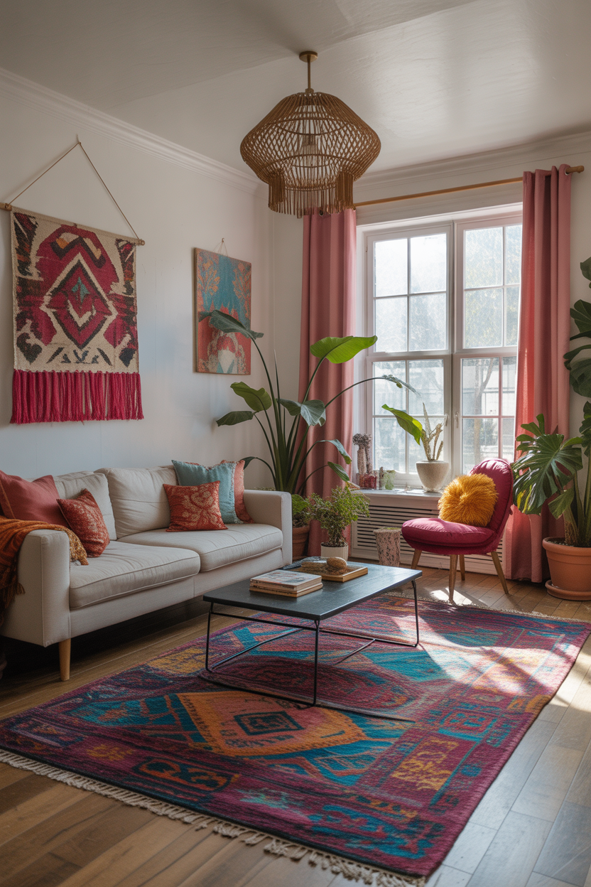
Bohemian design thrives on saturated color — think fuchsia, saffron, turquoise, and emerald all in one space. Mix vintage finds with macramé, layered rugs, and woven accents for a room that feels well-traveled and free-spirited.
The key is to keep things feeling collected, not chaotic. Stick to a few key patterns and repeat them across different textures (like pillows, throws, and wall hangings) for visual cohesion.
Best For: Maximalists and eclectic decorators who want a space full of soul.
Pro Tip: Stick with warm undertones across all colors to keep the room looking intentional rather than random.
23. Two-Tone Walls
Painting the top and bottom halves of your wall two different colors creates a subtle but super-stylish twist. Go with a darker tone on the bottom — like navy or charcoal — and a lighter one on top to lift the room visually.
This design trick adds depth and structure, especially in small living rooms where full-color walls might feel overwhelming. It’s like wainscoting without the carpentry.
Best For: Small spaces or open floor plans that need subtle zoning.
Pro Tip: Use painter’s tape and a level to get crisp, professional-looking lines when separating colors.
24. Sunset-Inspired Palette
Think soft corals, dusty rose, golden yellow, and muted purple — all the tones you’d find in a sunset sky. This palette is cozy and nostalgic but also stylish when layered thoughtfully.
Try sunset shades in gradient throw pillows, ombré curtains, or artwork with pastel blends. Use creamy whites or blush neutrals for your base so the colors feel like accents rather than overload.
Best For: Dreamy, cozy homes that feel like golden hour all day.
Pro Tip: Add curved furniture or round mirrors to mimic the softness and flow of a sunset scene.
25. Gallery Wall in Full Color
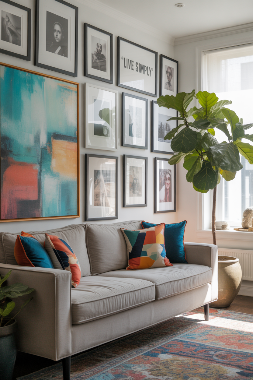
Instead of the usual black-and-white grid, go bold with a vibrant gallery wall. Mix bright art prints, colorful photography, and framed textiles to create a joyful, layered feature wall.
Use matching frames for a clean, modern look or mix frame styles for something more collected and artsy. Keep spacing consistent so the color stays the focus and the wall feels cohesive.
Best For: Creatives who love visual storytelling.
Pro Tip: Use paper templates taped to the wall before you hang — it helps you visualize your layout before committing to nails.
Final Thoughts
When it comes to designing a living space that feels truly alive, color is your most powerful tool. These 25 colorful living room ideas highlight how even small touches — like a vibrant rug, bold artwork, or playful pillows — can shift the entire vibe of a room. Whether your style is modern, boho, or something totally unique, color helps tell your story.
The beauty of colorful living room design is that it’s completely customizable. You can go full-on maximalist or simply add accents that reflect your personality. No matter your comfort level with bold tones, there’s always a way to create a space that feels energizing, warm, and uniquely yours.
Looking for even more ideas? Explore @TrendyDecorGuide on Pinterest for curated palettes, real-room inspo, and fresh tips to help you design a colorful space you’ll love living in.