15 Breezy Living Room Color Ideas to Refresh Your Space Instantly
Introduction
Have you ever walked into a room and instantly felt lighter, calmer, and more at ease? That feeling usually comes down to color, and breezy living room color ideas are one of the easiest ways to bring that same sense of relaxation into your own home. Whether you’re craving a coastal escape, a soft neutral retreat, or a fresh pop of color that feels like a breath of fresh air, the right palette can completely transform how a space feels. Living rooms are where we relax, gather, and unwind, so choosing colors that feel airy and inviting matters more than you might think.
In this post, you’re going to discover fifteen gorgeous color palettes that bring breeze, light, and warmth into your living room without overwhelming the space. From soft sky blues to creamy whites and gentle sage greens, each idea is designed to feel effortless and timeless. You’ll find inspiration whether you’re working with a small apartment or a spacious open-concept home. Get ready to fall in love with colors that make your living room feel like a permanent vacation.
1. Soft Sky Blue Walls
Soft sky blue is one of the most calming colors you can bring into a living room, instantly evoking clear skies and ocean breezes. This shade works beautifully on walls because it reflects light gently, making the entire room feel brighter and more open. It pairs effortlessly with white trim, light wood furniture, and natural textures like linen or rattan. Even on a cloudy day, sky blue walls can make your living room feel sunny and serene.
To really make this color shine, consider adding crisp white curtains and a few coastal-inspired accessories like woven baskets or seashell decor. Layering in soft gray accents can balance the blue and prevent the space from feeling too cold. This combination creates a relaxed, beachy vibe that still feels sophisticated and pulled together. It’s the kind of color choice that never goes out of style.
Best For: Coastal homes, sunrooms, and small living rooms
Pro Tip: Pair sky blue with natural wood for warmth.
2. Creamy Off-White Base
Creamy off-white is the ultimate breezy backdrop because it feels warm, soft, and endlessly versatile. Unlike stark white, off-white has subtle warmth that keeps a room from feeling sterile or cold. This shade works as a perfect canvas for layering in textures, patterns, and pops of color through pillows and throws. It also makes a small living room feel larger and more open by reflecting natural light beautifully.
This color pairs wonderfully with natural materials like jute rugs, rattan furniture, and wooden accents for an organic, lived-in feel. You can easily switch up your decor seasonally without worrying about clashing with the walls. Off-white also photographs beautifully, which is perfect if you love sharing your home on Pinterest or Instagram. It’s a timeless choice that grows with your style over the years.
Best For: Living rooms, hallways, and open-concept spaces
Pro Tip: Add texture with linen and woven materials.
3. Gentle Sage Green Accents
Sage green has become a favorite breezy color because it brings the calming energy of nature indoors without feeling overwhelming. This muted green shade works beautifully as an accent wall, on furniture pieces, or through soft textiles like throw pillows and curtains. It pairs effortlessly with creams, browns, and even soft blues for a layered, nature-inspired look. Sage green also has a way of making a room feel grounded and peaceful at the same time.
If you’re hesitant to commit to a full wall of color, start small with sage green accessories like vases, books, or a statement armchair. This allows you to test the waters while still enjoying the calming benefits this color brings. Sage green works in nearly any lighting condition, looking soft and warm in natural light and cozy in the evening. It’s a color that feels both modern and timeless.
Best For: Reading nooks, family rooms, and apartments
Pro Tip: Combine sage green with brass for elegance.
4. Pale Seafoam Touches
Pale seafoam is a dreamy, watery shade that instantly brings a breezy, refreshing quality to any living room. This color sits somewhere between blue and green, making it incredibly versatile and easy to pair with other colors. Seafoam works beautifully on accent walls, throw pillows, or even painted furniture pieces for a subtle pop of color. It has a way of making a room feel cool and refreshing, even during warmer months.
To balance seafoam’s coolness, pair it with warm wood tones, cream-colored furniture, and natural light. Adding metallic accents in gold or brass can also help elevate the look and prevent it from feeling too pastel. This combination creates a sophisticated yet relaxed atmosphere that feels perfect for unwinding after a long day. Seafoam is especially lovely in rooms that get plenty of natural sunlight.
Best For: Sunrooms, coastal cottages, and guest living rooms
Pro Tip: Use seafoam sparingly to avoid overwhelming the room.
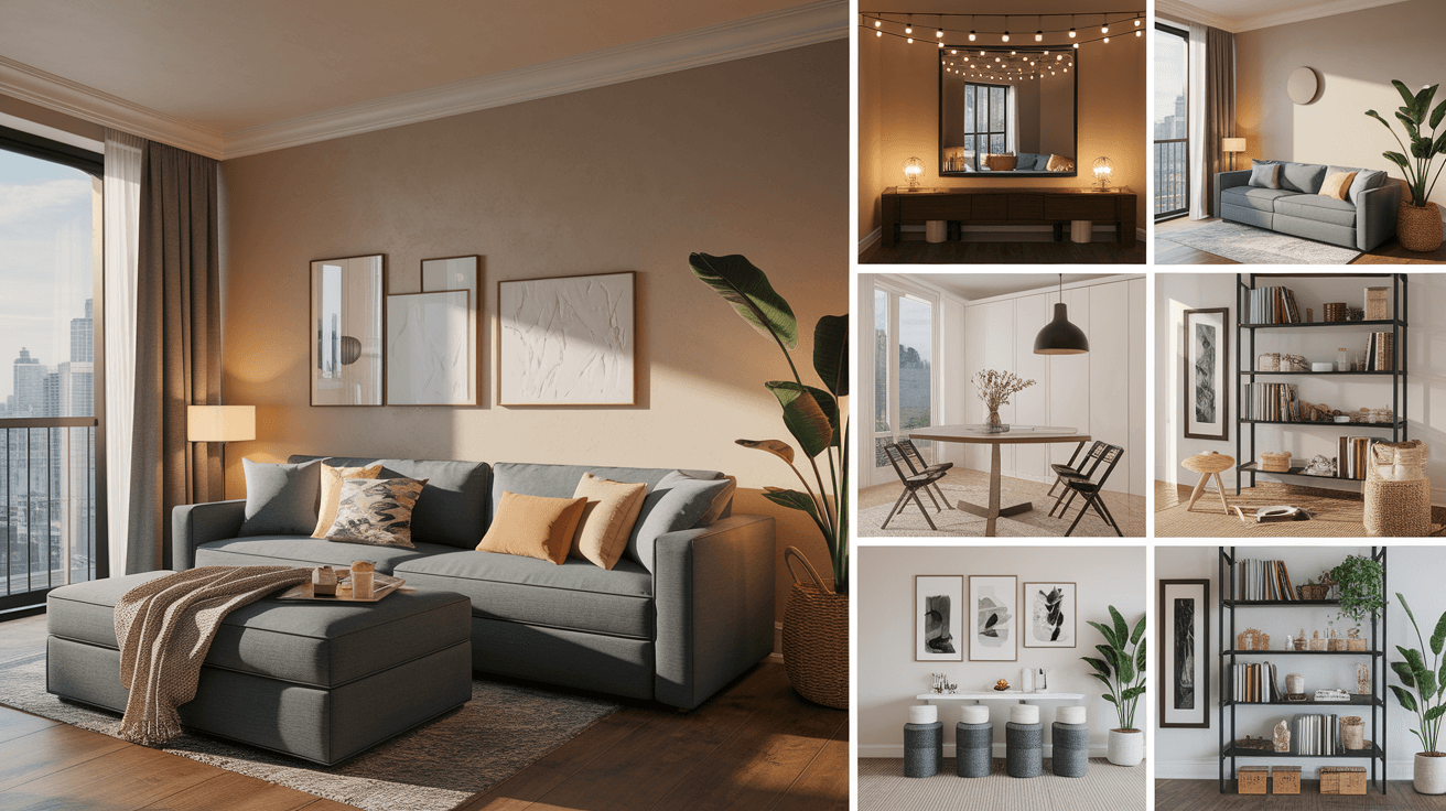
5. Warm Beige Foundations
Warm beige is the unsung hero of breezy living room colors because it creates a cozy yet airy foundation for any design style. Unlike cooler neutrals, warm beige has golden or pink undertones that make a space feel inviting and sun-kissed. This color works beautifully as a wall color, sofa fabric, or area rug, providing a soft backdrop for bolder accent pieces. It’s especially great for living rooms that don’t get a ton of natural light, as it helps brighten the space.
Pairing warm beige with crisp whites and natural textures like linen or cotton creates an effortlessly chic, breezy look. You can easily add pops of color through artwork, throw pillows, or fresh greenery without it feeling cluttered. This neutral base also makes it easy to update your decor seasonally with minimal effort. Warm beige truly is the foundation for a calm, welcoming living room.
Best For: Living rooms, dens, and multi-purpose spaces
Pro Tip: Layer different beige tones for visual depth.
6. Crisp White Trim Details
Crisp white trim might seem like a small detail, but it makes a huge difference in creating a breezy, polished living room. White trim around windows, doors, and baseboards helps define the architecture of a room while creating contrast against colored walls. This contrast makes colors pop while still keeping the overall look fresh and clean. It’s a simple update that can completely transform the feel of your space without a full renovation.
When paired with soft pastel or neutral wall colors, white trim creates a classic, coastal-inspired aesthetic that feels timeless. It also helps bounce natural light around the room, making everything feel brighter and more open. This detail works in nearly any home style, from modern farmhouse to traditional coastal. Crisp white trim is proof that sometimes the smallest changes make the biggest impact.
Best For: Living rooms, entryways, and craftsman-style homes
Pro Tip: Use semi-gloss paint for trim durability and shine.
7. Light Powder Blue Accents
Light powder blue brings a soft, nostalgic charm to living rooms while still feeling fresh and modern. This pale shade works beautifully on accent walls, vintage furniture pieces, or even ceiling paint for a subtle “sky” effect overhead. Powder blue pairs wonderfully with white, cream, and soft pink for a romantic, breezy color scheme. It’s a color that feels both calming and cheerful at the same time.
This shade looks especially lovely paired with brass or gold hardware, which adds a touch of warmth and sophistication. Floral patterns, gingham, and stripes all work beautifully alongside powder blue for a charming, cottage-inspired look. Even a small dose of this color through pillows or a vintage chair can make a big visual impact. Powder blue is perfect for anyone who loves a soft, romantic aesthetic.
Best For: Cottage homes, nurseries-turned-living-rooms, and reading corners
Pro Tip: Pair powder blue with brass for vintage charm.
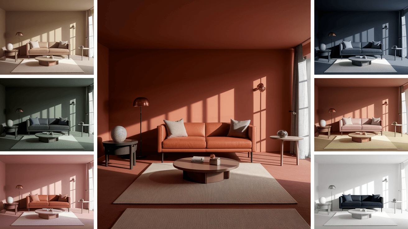
8. Soft Terracotta Warmth
Soft terracotta brings an earthy, sun-baked warmth that perfectly balances breezy color palettes without feeling heavy. This muted clay shade works wonderfully as an accent color through pillows, pottery, or a statement piece of furniture. Terracotta pairs beautifully with creams, sage greens, and warm woods for a Mediterranean-inspired look. It adds just enough warmth to keep a breezy room from feeling too cold or sterile.
This color is especially striking when paired with natural materials like rattan, jute, and unfinished wood for an organic feel. A few terracotta accents can instantly add depth and personality to an otherwise neutral living room. This shade also works beautifully in rooms with lots of plants, as the green and terracotta combination feels incredibly natural. Soft terracotta is the perfect way to add warmth without sacrificing that breezy feel.
Best For: Boho living rooms, sunrooms, and plant-filled spaces
Pro Tip: Combine terracotta with greenery for natural balance.
9. Misty Gray Backdrops
Misty gray is a sophisticated, breezy color that works as a neutral backdrop for nearly any design style. This soft shade has cool undertones that create a calm, serene atmosphere, perfect for living rooms used for relaxing and unwinding. Misty gray pairs beautifully with white, navy, and even soft pastels for a layered, modern look. It’s a versatile choice that won’t feel outdated as trends change over time.
This color works especially well in living rooms with large windows, as natural light brings out subtle blue or lavender undertones throughout the day. Pairing misty gray with metallic accents like silver or chrome creates a clean, contemporary feel. Adding plush textures like velvet or faux fur can warm up the coolness of this shade beautifully. Misty gray is the perfect choice for anyone who loves a calm, collected living space.
Best For: Modern apartments, urban lofts, and minimalist homes
Pro Tip: Add velvet textures to soften gray’s coolness.
10. Pale Lavender Whispers
Pale lavender brings a soft, dreamy quality to living rooms that feels both calming and slightly luxurious. This delicate shade works beautifully on accent walls or through soft furnishings like throw blankets and curtains. Lavender pairs wonderfully with grays, whites, and even soft greens for a soothing, spa-like atmosphere. It’s a color that feels gentle without being overly feminine, making it work in nearly any living room style.
This shade looks especially beautiful in the evening when warm lighting brings out its soft, romantic undertones. Pairing lavender with natural wood tones helps ground the color and keep the room feeling balanced. A few lavender accents can completely transform a neutral living room into something special and unique. Pale lavender is perfect for anyone looking to add a touch of softness and serenity.
Best For: Bedrooms turned living rooms, reading nooks, and spa-style homes
Pro Tip: Use lavender with warm lighting for cozy evenings.
11. Buttery Yellow Highlights
Buttery yellow is a breezy color that instantly brings sunshine and cheerfulness into any living room. This soft shade works best as an accent color through pillows, artwork, or a single statement piece of furniture. Yellow pairs beautifully with grays, whites, and navy for a cheerful yet balanced color scheme. It’s a wonderful way to brighten up rooms that don’t get a lot of natural sunlight.
This color works especially well in living rooms with a more playful, eclectic style, as it adds energy without overwhelming the space. A little goes a long way with buttery yellow, so consider starting with smaller accents before committing to larger pieces. Pairing this shade with green plants creates a fresh, garden-inspired feel that’s perfect for spring and summer. Buttery yellow is proof that breezy colors don’t have to be cool-toned to feel relaxing.
Best For: Family rooms, breakfast nooks, and sunrooms
Pro Tip: Use yellow sparingly for a cheerful accent pop.
12. Soft Coral Whispers
Soft coral brings a playful, breezy energy to living rooms that feels fresh without being too bold. This warm pink-orange shade works beautifully as an accent color through throw pillows, artwork, or a statement chair. Coral pairs wonderfully with whites, creams, and soft blues for a tropical-inspired color palette. It’s a color that instantly makes a room feel happier and more vibrant.
This shade works especially well in living rooms with lots of natural light, as sunlight enhances coral’s warm, glowing quality. Pairing coral with greenery creates a fresh, tropical vibe that feels perfect for warmer months. A little coral goes a long way, so start with smaller accessories before committing to larger furniture pieces. Soft coral is perfect for anyone who wants their living room to feel like a permanent summer vacation.
Best For: Tropical-themed rooms, sunrooms, and beach houses
Pro Tip: Pair coral with white for a fresh contrast.
13. Driftwood Gray-Brown
Driftwood gray-brown is a unique, breezy neutral that brings the calming feel of beach driftwood right into your living room. This warm-cool hybrid shade works beautifully on walls, furniture, or flooring for a grounded, natural look. Driftwood pairs wonderfully with whites, soft blues, and greens for a coastal-inspired color scheme. It’s a versatile shade that feels both modern and rustic at the same time.
This color works especially well paired with natural textures like linen, jute, and woven baskets for an organic, beachy feel. Driftwood gray-brown also pairs beautifully with black accents for a more modern, updated coastal look. This shade tends to look different throughout the day depending on lighting, which adds visual interest to the room. Driftwood is perfect for anyone who wants a coastal feel without going too literal with nautical themes.
Best For: Beach houses, lake homes, and coastal-modern spaces
Pro Tip: Combine driftwood tones with black for contrast.
14. Icy Mint Touches
Icy mint is a cool, refreshing shade that brings a unique twist to breezy living room color palettes. This pale green-blue works beautifully as an accent color through pillows, vases, or a statement piece of furniture. Mint pairs wonderfully with whites, grays, and even soft pinks for a fresh, modern look. It has a crisp, clean quality that instantly makes a room feel more refreshing.
This shade works especially well in living rooms with a modern or retro-inspired design, as mint has a slightly nostalgic quality. Pairing icy mint with brass or gold accents helps balance its coolness with warmth. A little mint goes a long way, so consider using it through smaller accessories rather than large furniture pieces. Icy mint is perfect for anyone who wants their living room to feel fresh and a little playful.
Best For: Retro-style homes, apartments, and creative studios
Pro Tip: Balance mint with warm metallics like brass.
15. Soft Champagne Glow
Soft champagne is a warm, breezy neutral that brings a subtle glow and elegance to any living room. This shade sits between beige and gold, creating a soft shimmer effect that feels luxurious yet relaxed. Champagne pairs beautifully with whites, creams, and soft blues for an elevated, breezy color palette. It works especially well in living rooms where you want a touch of glamour without feeling too formal.
This color looks stunning paired with metallic accents like gold, brass, or champagne-toned mirrors and frames. Soft champagne also pairs beautifully with plush textures like velvet for a cozy yet sophisticated feel. This shade tends to look warmer in the evening and softer during the day, adding versatility to your space. Soft champagne is perfect for anyone who wants their living room to feel breezy yet a little bit special.
Best For: Living rooms, formal sitting areas, and apartments
Pro Tip: Add gold accents to enhance champagne’s glow.
Final Thoughts
These fifteen breezy living room color ideas prove that creating a calm, refreshing space doesn’t have to be complicated or expensive. Whether you’re drawn to cool blues and greens or warm neutrals and soft pastels, there’s a palette here for every style and home. The key is choosing colors that make you feel relaxed and happy every time you walk into the room. Don’t be afraid to mix and match a few of these ideas to create a space that feels uniquely yours.
Now it’s your turn to bring some of this breezy energy into your own living room, one color at a time. Start small with a few accent pieces, or go bold with a fresh coat of paint on your walls. Whatever you choose, remember that your living room should feel like your own personal retreat. For more home decor inspiration, visit us at the trendy decor guide.